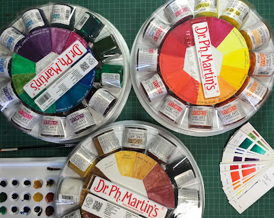
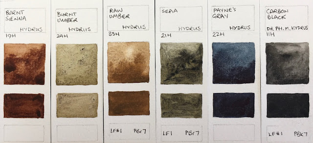
 One of my lovely students, Sakshi, lent me a full set of Dr. Ph. Martin's Hydrus watercolours to test, which was great as they claim to be a range of pigmented lightfast liquid watercolours. Not something I am particularly interested in using necessarily, but interesting to try. I'm curious how they differ from working with pigmented inks.
They came in 4 sets of 12 bottles. Three sets are standard watercolours and the third is Iridescent watercolours. I'll concentrate on the 'normal' watercolours first and I will add those later...
When Sakshi first painted them out, the colours were mostly reasonably smooth, but some have changed quite dramatically over time and had separated in the bottles. I've photographed her original wheels to show the difference (see below).
Some bottles had pigment and lightfast information on them, but some didn't at all.
I have photographed them in a logical order, though not in the sets they were purchased in. As always I have tried to capture the correct colour and will note below how it differs on my screen.
The Hansa yellow light is a bright cool yellow, the Hansa yellow medium a clean primary yellow. Gamboge is a very warm two pigment mix - brighter and slightly more orange than it appears on my screen. Hansa Yellow Deep and Chrome Yellow are almost the same orange-yellow hue. Rather like PY110 often looks.
 |
| Dr. Ph Martin's Hydrus Watercolours - Titanium White, Hansa Yellow Light, Hansa Yellow Medium, Gamboge, Hansa Yellow Deep, Chrome Yellow. |
Crimson lake is also very similar to the crimsons above. PR269 is rated III so not lightfast enough for watercolours. The Quinacridone magenta is a lovely colour but the Quinacridone Violet wouldn't paint out nicely. Nor would the Ultramarine red violet. Cobalt violet looks very like a PV23 but no information was given. Ultramarine does not contain PB29 but a mix that is more like a phthalo blue red shade in hue.
 |
| Dr. Ph Martin's Hydrus Watercolours - Crimson Lake, Quinacridone Magenta, Quinacridone Violet, Ultramarine Red Violet, Cobalt Violet, Ultramarine. |
Cobalt blue looks like another phthalo pigment - it is certainly not PB28. Phthalo blue painted out nicely. As did Turquoise blue. Blue aqua could do with more blue in it be different enough from Phthalo Green. Sap green separated badly and was very odd.
The 4th set is the iridescent colours. I'll admit that am not as interested in iridescent watercolours, though I realise they are of value to many, especially calligraphers. I'll paint out swatches on white and black paper and add them eventually, but it's hard to really show how they really look in photos as the sheen doesn't replicate.
Liquid watercolours can be used in the studio of course, and it is easy to create repeatable recipes since they come with an eye dropper. They can also be used to fill water-brushes so they can be used on location. I know of one sketcher who had a water-brush filled with yellow to keep that colour clean. Another uses a range of greys. Otherwise, like inks, they are more risky on location as they can obviously spill.
I allowed my samples to dry and attempted re-wetting them without satisfactory results so they are best used fresh from the bottle.
See also -
 |
| Dr. Ph Martin's Hydrus Watercolours - Cobalt Blue, Phthalo Blue, Turquoise Blue, Blue Aqua, Phthalo Green, Sap Green. |
Here are the colours as painted out when the set was new. Some look a little streaky even at this stage. This is set one.
 |
| The first set - Hydrus watercolours courtesy of Sakshi. |
 |
| The 2nd set - Hydrus watercolours courtesy of Sakshi. |
 |
| The third set - Hydrus watercolours courtesy of Sakshi. |
The 4th set is the iridescent colours. I'll admit that am not as interested in iridescent watercolours, though I realise they are of value to many, especially calligraphers. I'll paint out swatches on white and black paper and add them eventually, but it's hard to really show how they really look in photos as the sheen doesn't replicate.
 |
| The 4th set - Hydrus Iridescent watercolours courtesy of Sakshi. |
I allowed my samples to dry and attempted re-wetting them without satisfactory results so they are best used fresh from the bottle.
See also -
Blockx full range here
Daniel Smith new colours 2017 here
Daniel Smith full range here
MaimeriBlu full range here
Mijello Mission Gold full range here
Old Holland full range here
MaimeriBlu full range here
Mijello Mission Gold full range here
Old Holland full range here
Schmincke new colours 2017 here
Schmincke full range here
Winsor & Newton full range here


