Quantcast
Channel: Jane Blundell Artist
Viewing all articles
Browse latest Browse all 214

Jane's Blacks.

$
0
0

I wrote a blog post in 2015 Custom Watercolour Mixes - a question of Greys about creating various mixed greys, without the use of black or white pigments. Daniel Smith Art Materials created Jane's Grey - the lovely mix of Burnt Sienna and Ultramarine - as a signature colour in 2019. From 2018, I've also been working with their wonderful chief chemist on some interesting mixed blacks. We looked at an earth grey as well, but as a three pigment mix it was rather complex. We also looked at a Red/Blue mixed black but eventually narrowed down to just two.

Jane's Grey R/G (Red/Green) began last century when I mixed Anthraquinoid Red with Phthalo Green BS and discovered a fabulous range of colours from a deep green and deep maroon to a rich black. I love it when colours totally and perfectly neutralise each other! This mixing pair creates gorgeous fig, plum, aubergine and Perylene Green hues - colours that are otherwise quite tricky to mix. 

Over the years I modified this to use Pyrrol Crimson instead and created tubes of this colour as a premix for myself and my students. The neutral black created is staining and non-granulating, so can also be useful for tonal underpainting or wherever a rich black is required.


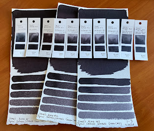
Various paint-outs of Jane's Black R/G in development


We exchanged emails and samples over a number of years to get the perfect neutral black. Not too much PG7, not too much PR264. 

I use this for paintings that are largely red and green - roses, tulips, and so on, but also as a general rich black as it is easy to mix from my palette colours. This keeps colour harmony in paintings. Add a little phthalo green for rich deep greens, or add a little more Pyrrol Crimson for wonderful maroon colours - the colours of crimson in shadow.


I needed it a lot when painting in Amsterdam, as many buildings are painted in a rich black or grey. This sketch of the cafe that dates back to 1695 shows Jane's Black (Red/Green) in action. I mixed it up from tubes in my hotel room to create enough to work with on a number of buildings. This makes it more consistent than mixing it in the palette on the fly and having the colour gradually change. In the windmill is was diluted to a grey for the look of faded paint.


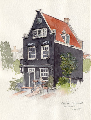
Jane's Black (Red/Green) in use on a fabulous building, now a cafe, built in 1695, and as a faded black for the windmill.


The tonal flower study also shows the use of Jane's Black Red/Green as a non-granulating staining grey. This is known as Grisaille painting. The subtle greys are lovely. They are non-granulating and fairly staining so can be glazed over with colour if desired.


Jane's Black Blue/Orange is useful when painting subjects that are based around earth colours or dominated by blue and orange. This colour was a little more complex. It was the perfect mixing pair when the more red version of Daniel Smith PO71 Transparent Pyrrol Orange was available. However that changed in 2019. To create this lovely black a little PR188 needed to be added to the mix. The range of beautiful browns and deep blues that this mixing pair can create is also inspiring, and it suits bird paintings with orange and blue feathers or rocks and stones.


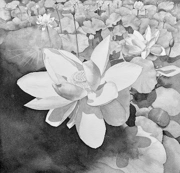
The black created is also a neutral black, staining and non-granulating and not really distinguishable from Jane's Black R/G, but I would choose to use them differently so that the gradual adjustment to warm or cool the black can vary. This is warmed with an orange such as transparent pyrrol orange (or a red), and cooled with a blue - in this case Phthalo Blue Red Shade, though other blues will also work. I've used it in this painting of 'Stones, Kiama' though I could have used either black for this subject. 


Jane's Black Red/Green and Jane's Black Blue/Orange have been released as signature colours, along with three other new colours - Chrome Titanate Yellow - a terrific Naples yellow option made with PBr24; Iridescent Vibrant Raspberry; and King's Royal blue.

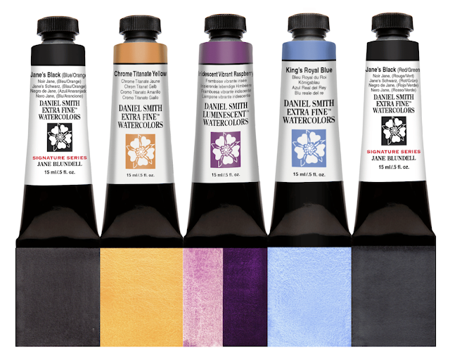
New Daniel Smith colours - Jane's Black (Blue/Orange), Chrome Titanate Yellow, Iridescent Vibrant Raspberry
and King's Royal Blue.

I plan to continue to explore Jane's Black Yellow/Purple options looking for the perfect mixing pair to complete the series. It is more difficult to find a two-pigment mix, but it can be done with a three-pigment mix. It would be the perfect black for yellow and purple studies - irises, sunflowers etc.

Happy painting!

Viewing all articles
Browse latest Browse all 214

Trending Articles