I've been doing a lot of sorting lately, since moving into a smaller house. It's a good chance to assess what is useful and what is not and reduce the clutter. I thought, however, that some of the things that I don't need to keep may still be useful, so I took a few photographs before recycling these pages.
When I am running workshops and doing demonstrations I do a number of pages of quick studies and sketches and though they are not carefully finished, they still show what I was explaining. I've selected sections of a few pages to share here.
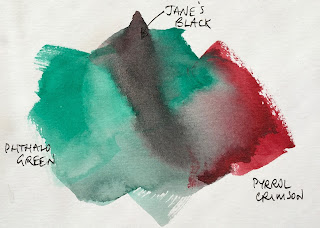
Anyone familiar with my work will know about Jane's Grey. Here's a quick demo of the mix. I don't suggest for a moment that you don't also explore the gorgeous range of hues you can create mixing ultramarine and burnt sienna on the palette or on the paper, but as a pre-mix it's incredibly useful.
 |
| Jane's Black mix. |
My students are currently using it to create a tonal underpainting that will be glazed later with washes of colour.
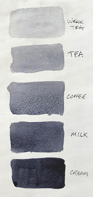
Here is a demonstration about the various strengths I aim for in watercolour. Starting with a very thick (like cream) mix of watercolour - as shown on the bottom - I add a 'brushful' of water to create gradually lighter tones.
 |
| Determining tones in watercolour |
The 'cream' mixture will move slowly on the palette, just as pouring cream would. The 'milk' mixture moves a little more freely, but is not as liquid as the 'coffee' mixture. Think of black coffee here - liquid but not at all thick. Then 'tea' is more diluted, just as black tea is usually transparent. The weak tea is exactly that - rather like coloured water.
As we are talking about watercolour, we must always add water - the paint straight from the tube needs to be diluted before use, otherwise it will do what is called 'bronzing' and dry with an ugly sheen.
This quick demonstration shows in a very immediate way what sorts of colour mixes can be obtained when working with a well-chosen warm and cool red, yellow and blue. Here I've used hansa yellow medium (which is strictly speaking a mid yellow, but works much the same as a lemon yellow) along with quinacridone gold (a warm but neutralised yellow); quinacridone rose and pyrrol scarlet as the cool and warm reds respectively and ultramarine and phthalo blue GS as the warm and cool blues.
 |
| Mixing a warm and cool red, yellow and blue. |
I have many pages of this sort of sketch explanation. Do you want to see more? And if so, about any particular aspect of watercolour?
