My first watercolours over 35 years ago was a small sketching kit - Cotman student colours I suppose - that I still had until my car was broken into and it was taken about 10 years ago. I'd changed the colours over to professional colours by then but I rather liked that palette and it had been all over the world with me..
I don't use many Winsor & Newton watercolours are they are very expensive outside of the UK, and some of my favourite colours are mixed pigment or different hues so they just don't suit what I am after. For example burnt sienna is PR101 rather than my preferred PBr7; raw sienna is a mix of Py42 + PR101 rather than PBr7, Quinacridone Gold is a rather unnecessary and ugly mix of three pigments PY150+PR206+PV19 (when they could have simply used PY150 + PR101) and raw umber is not deep and dark enough. I also find that the tube colours don't rewet terribly well without adding some glycerine since they are, I understand, designed to be used fresh from the tube.
However, they are a very well-known brand, usually available throughout the world, and they have some great colours so here is the (almost) full range - I'm missing 5....
The swatches have been photographed and colour matches are ok but not perfect. I'll note in my comments where they are way out.
PY53 is not a powerful pigment. I've never found a use for it, and there are much prettier cool or lemon yellows available.
![]() |
| Winsor & Newton Watercolours - Lemon Yellow, Bismuth Yellow, Cadmium Lemon, Winsor Lemon, Winsor Yellow. |
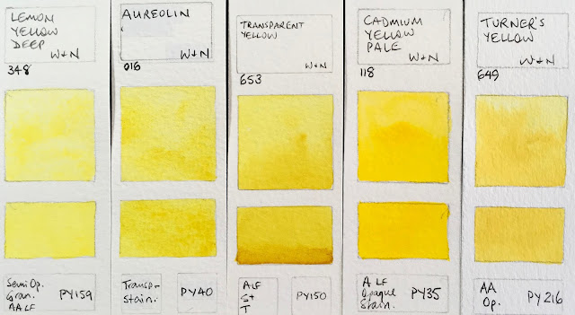
I rather like the Transparent Yellow of this row. Turner's Yellow has more of a slight yellow ochre pastel look to it than it appears here. Picture the look of a cad deep mixed with a little white.
![]() |
| Winsor & Newton Watercolours - Lemon Yellow Deep, Aureolin, Transparent Yellow, Cadmium Yellow Pale, Turner's Yellow. |
These yellow are all much more orange-yellow than they appear - I just can't adjust to make them look right. Winsor Yellow Deep is made with an excellent warm yellow pigment.
![]() |
| Winsor & Newton Watercolours - New Gamboge (now made with PY150 + PR209), Cadmium Yellow, Winsor Yellow Deep, Indian Yellow, Cadmium Yellow Deep. |
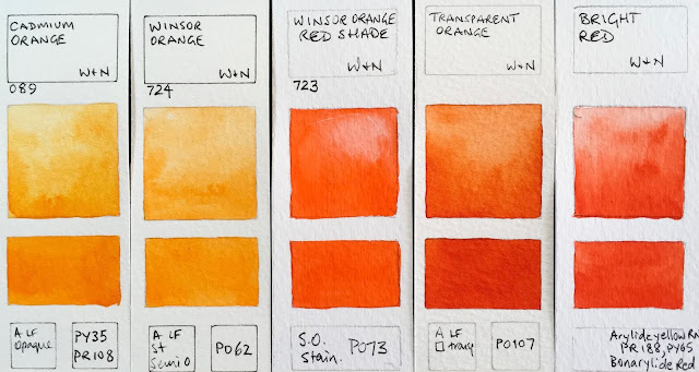
Cadmium Orange and Winsor Orange are more orange then they look here and Winsor Orange Red Shade is more or a warm red. Transparent Orange is one of the three most beautiful single pigment oranges - along with Schmincke Transparent orange and Da Vinci Benzimida Orange Deep.
![]() |
| Winsor & Newton Watercolours - Cadmium Orange, Winsor Ornage, Winsor Orange Red Shade, Transparent Orange (Limited Edition Colour), Bright Red (discontinued). |
Scarlet Lake is probably the best warm red option.
![]() |
| Winsor & Newton Watercolours - Cadmium Scarlet (not shown), Scarlet Lake, Cadmium Red, Cadmium Red Deep, Winsor Red. |
I like Winsor Red Deep for a good strong crimson. these swatches are closer to reality. I never use Alizarin Crimson but I do think it is helpful that is is still manufactured, as long as it is clearly marked as fugitive.
![]() |
| Winsor & Newton Watercolours - Rose Dore, Quinacridone Red, Winsor Red Deep, Permanent Alizarin Crimson, Alizarin Crimson. |
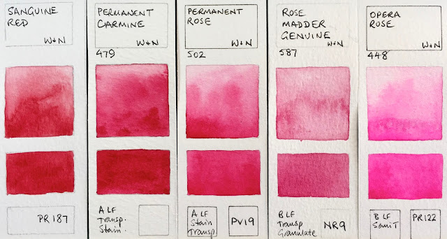
Permanent Rose is great as a mixing rose or even as a primary red. W&N are the only manufacturer to still make genuine Rose Madder, and I'm glad it is still available to see what it looks like though it is also fugitive.
![]() |
| Winsor & Newton Watercolours - Sanguine Red (discontinued), Permanent Carmine, Permanent Rose, Rose Madder Genuine, Opera Rose. |
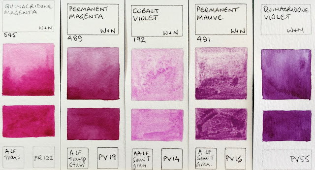
Quinacridone Magenta is a perfect choice for a CYM palette.
![]() |
| Winsor & Newton Watercolours - Quinacridone Magenta, Permanent Magenta, Cobalt Violet, Permanent Mauve, Quinacridone Violet. |
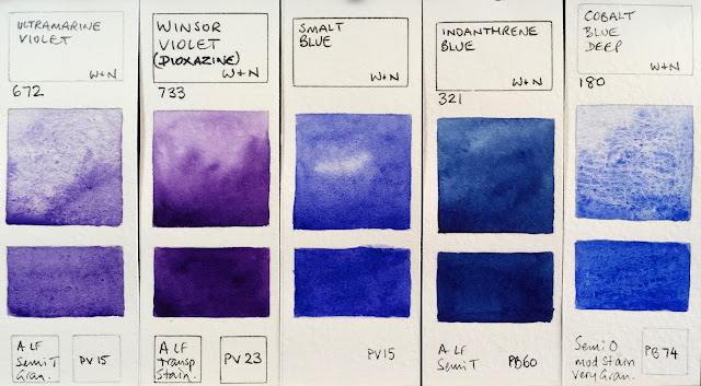
I like the granulation of PV15 Ultramarine, though it is not a strong mixer. I was really surprised to see this pigment in the rather amazing Smalt Blue limited edition colour.
![]() |
| Winsor & Newton Watercolours - Ultramarine Violet, Winsor Violet (Dioxazine), Smalt Blue (limited edition), Indanthrene blue, cobalt Blue Deep. |
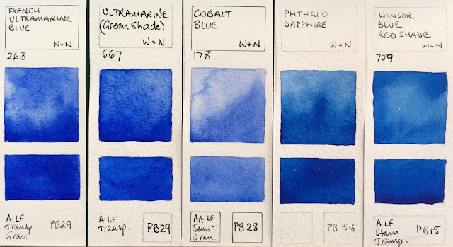
![]() |
| Winsor & Newton Watercolours - French Ultramarine, Ultramarine (Green Shade), Cobalt blue, Phthalo Sapphire, Winsor Blue Red Shade. |
![]() |
| Winsor & Newton Watercolours - Antwerp blue, Prussian blue, Winsor Blue (Green Shade), Cerulean Blue Red Shade, Cerulean Blue. |
Cobalt colours are expensive, but add so much lovely texture.
![]() |
| Winsor & Newton Watercolours - Manganese Blue Hue, Phthalo Turquoise, Cobalt Turquoise Light, Cobalt Turquoise, Cobalt Green. |
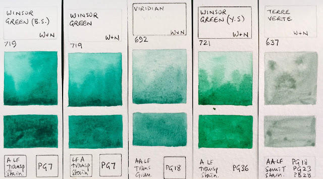
Winsor Green and Winsor Green Blue Shade are the same thing if they are made with PG7.
![]() |
| Winsor Green (Blue Shade), Winsor Green, Viridian, Winsor Green (Yellow Shade), Terre Verte. |
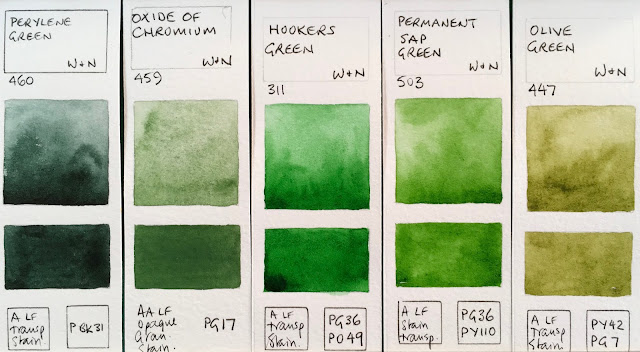
I love Perylene Green for the shadows in foliage and am rather fascinated by the granulation and opacity of PG17 though I've never really explore this pigment.
![]() |
| Perylene Green, Oxide or Chromium, Hooker's Green, Permanent Sap Green, Olive Green. |
Green gold is useful for the look of sunlight shining through foliage...
![]() |
| Winsor & Newton Watercolours - Terre Verte (Yellow Shade) not shown, Green Gold, Naples Yellow, Naples Yellow Deep, Yellow Ochre Light (not shown). |
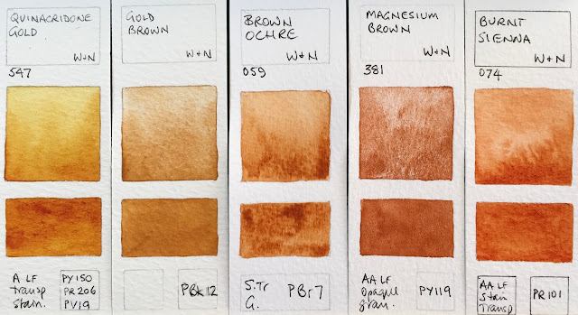
The Raw Sienna mix is one of the reasons I don't use W&N earth colours, though I do like the yellow ochre.
![]() |
| Winsor & Newton Watercolours - Yellow Ochre, Raw Sienna, Yellow Titanate, Gold Ochre, Quinacridone Gold (genuine - discontinued) |
Magnesium Brown is rather fun. Schmincke has just released a colour using this pigment too.
![]() |
| Winsor & Newton Watercolours - Quinacridone Gold, Gold Brown (limited edition), Brown Ochre, Magnesium Brown, Burnt Sienna. |
W&N Indian red is a fairly well behaved version of this colour. It can be rather wild and a little crazy, which is fun. Indian Red Deep is an interesting red-brown pigment made by a few other manufacturers. Brown Madder is Quinacridone Burnt Scarlet in DS.
![]() |
| Winsor & Newton Watercolours - Light Red, Venetian Red, Indian Red (limited edition), Brown Madder. |
Raw Umber is another of the W&N colours that I just don't like - I much prefer the deep dark cool brown versions of Daniel Smith or Da Vinci and others.
![]() |
| Winsor & Newton Watercolours - Potter's Pink, Perylene Maroon, Perylene Violet, Caput Mortuum Violet (not shown), Raw Umber. |
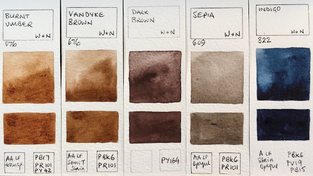
![]() |
| Winsor & Newton Watercolours - Burnt Umber, Vandyke Brown, Dark Brown (special limited edition), Sepia, Indigo. |
I'd be curious to know if the W&N Mars Black is as granulating is the DS one. Also just released this year by Schmincke.
![]() |
| Winsor & Newton Watercolours - Payne's Grey, Neutral tint, Ivory Black, Lamp Black, Mars Black (not shown) |
I don't tend to use black or white watercolours but they are important, as are some greys for convenience.
![]() |
| Winsor & Newton Watercolours - Charcoal Grey, Davy's Grey, Chinese White, Titanium White. |
As always, please let me know if I have made any errors.
Happy painting :-)
See also -
Daniel Smith new colours 2017
hereDaniel Smith full range
hereSchmincke new colours 2017
here Schmincke full range
hereMaimeriBlu full range
hereMijello Mission Gold full range
here
I'm working on Da Vinci and Old Holland next...