Quantcast
Channel: Jane Blundell Artist
Viewing all 214 articles
Browse latest View live

Oranges

$
0
0
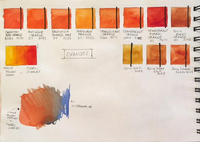
Week two was Oranges
Orange is one of my favourite colours, and I love the mixing pair of an orange and a blue. Burnt Sienna, Burnt Umber and a number of the orange-earth pigments are also neutralised oranges as you can see in the little painted mix with Ultramarine, but I've chosen to focus on the brighter oranges here.

While I don't usually include an orange in my palette (apart from Transparent Pyrrol Orange, which I use as a warm red), since it is so easy to mix with Hansa yellow and pyrrol scarlet as shown, there are some gorgeous orange pigments available.

Reds

$
0
0
The third week was reds. It's rather a long time ago now - I've been to Bathurst and the UK and back, then New Zealand and back. So much to write about...

I find reds fascinating. Adjust the bias from orange to purple and the mixing possibilities change dramatically. I tend to choose the semi-transparent reds though the cadmiums are excellent pigments. I like to use three reds rather than the standard warm and cool - a warm, a crimson and a rose red - great mixing options there.

I love the dramatic blacks and greys you can mix with a good strong crimson and phthalo green. And phthalo blue with a warm red won't make a purple. Fascinating :-)

My students had a go at painting a still life filled with red objects and using greens to create the shadow colours.
See more red pigments on my website here

A busy month...Bathurst, NSW

$
0
0
July started out with a great week teaching a 5-day watercolour workshop in Bathurst, NSW. It's run by Art Scene, a terrific art store in Sydney. Up to 25 tutors and a couple of hundred students head to Bathurst twice a year for this Mitchell Summer or Winter Art School.

I taught Mastering Watercolours to a lovely group of participants. They worked very hard to explore their pigments, mix them to create colour wheels, colour charts and then a range of paintings to explore many different watercolour techniques. I'll do it again in January :-)


At the end of the week we had an exhibition of all the students' work arrange by tutor - very impressive.

Then I headed straight home to get on a plane to the UK...

Purples

$
0
0
Purples are easily mixed, but there are many different characteristics to explore - staining, granulating, lifting...Mixing yellows to neutralise purples creates another fabulous range of colours from deep greys through earthy colours depending on the colours chosen.

See more purples on my website here.

Teaching in Bath, United Kingdom. July 2016.

$
0
0
I flew into Heathrow and headed straight to Bath to prepare to teach another 5 day watercolour workshop. It's terrific having that much time to thoroughly introduce watercolour to both new and more experienced participants.


My students spent the week getting familiar with their colours, making colour wheels and charts and painting a range of studies exploring many watercolour techniques. Washes, softening edges, glazing, wet-in-wet, dry-brush, splatter, salt...so many techniques to play with and explore :-)
Before and after classes, I headed down to the river to sketch the beautiful Pulteney Bridge - one of only three such bridges in the world, the others being the Rialto and the Ponte Vecchio.

Bath is full of gorgeous sandstone. We sketching just a little as part of the watercolour workshop and will do a little more in the repeat workshop in July 2017. We are considering an Urban Sketching week in 2018 though need to figure out great locations in case of rain.

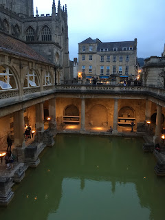
I visited the Roman Baths in the evening. It's lovely to see the transition between the ancient bath house and the more recent upper story additions. 


I then visited the enormous Art in Action event, a massive festival of arts near Oxford, before catching a cross-country bus to Cambridge.

Cambridge

$
0
0
I didn't have very long in Cambridge this time, but as I was staying in an Air BnB with a bike, I was able to cover some ground :-)

Gonville and Caius College, Cambridge
I love the Gonville and Caius building, which is opposite Great St Mary's and next to the Senate building. I suppose I like the scale of it - not as enormous as the lovely Kings College and others that date back so many centuries, but more of a 'human' scale.

Gonville and Caius from St Mary's.


I started painting the tower it last April on a very cold windy day, so was determined to return to my spot outside St Mary's and finish it this year. Last year I also went up and had a look at the view of Cambridge from the St Mary's tower - quite wonderful. This year I sat in the sunshine, and a busker set up and started singing gorgeous love songs just behind me. What a tough life :-)

Gonville and Caius tower,
Moleskine watercolour sketchbook A5.
Herring Compact palette
with Daniel Smith colours.
There were tour groups wandering past giving a commentary in various languages and a lovely sense of Summer holidays.

I was using my lightweight Herring palette - shown left - which I have modified to hold 24 Daniel Smith watercolours. More than really necessary but I enjoy having so many colour options and a number of lovely earth colours and convenience greens. Here are the colours in this palette and here is a post on many of the palettes I use for watercolour and gouache.

The brushes are Rosemary & Co - a size 10 and a new size 2 sable, and I was also using a Faber Castell watersoluble graphite pencil and a Copic cool grey felt tip pen.


The markets in Cambridge are open every day, but with different stalls on different days. I bought a lot of gorgeous fresh summer berries :-)

I also spent some time sketching from this shaded position - a rather nice view of Great St Mary's from the rear. It's a very important church for the university - all Cambridge students must live within 3 miles of it. On graduation day they parade to the church, and then into the Senate building to be presented with their degrees.


Great St Mary's, Cambridge, in The perfect sketchbook B5. Stage one.
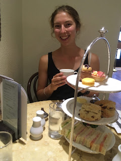
A visit to Cambridge wouldn't be the same without enjoying some of the college gardens, checking out the freshly made fudge shop, a high tea, a cello and violin concert in a stunning chapel and an open air Shakespeare - all with my lovely daughter as my tour guide! 


Walking around in Cambridge, like Bath, is lovely. I feel there are more historical buildings in one English city than in my whole country! Fortunately many of them are beautifully preserved.

I'll come back next year and finish my painting :-)

Gamboge - what is it?

$
0
0
Many people are familiar with the name Gamboge, often called New Gamboge, but not so many will have come across the resin that made the original paint.

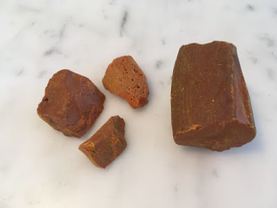
Gamboge chunks
NY24 is Natural Yellow 24 - natural gamboge, a resin from a few trees found in Asia from the Garcina genus, and particularly in Cambodia. the name is derived from cambugium - as is the name Cambodia itself. It is a strange substance, appearing as a dull earthy yellow lump but when you touch a brush to it a stunning yellow paint appears. Sadly, though, it is a fugitive colour, not suited to long-term use.

Most companies have a paint based on this pigment colour. It is generally a mid to warm transparent yellow.

PY153 was a popular pigment to use - available in Daniel Smith and Winsor & Newton, but it is no longer available so alternative mixes are being used. You can read a great W&N article about it here.

Natural Gamboge painted out as a pigment


Here is the natural gamboge. A touch of a wet brush and the colour is a very pure and lovely yellow.

But it also fades. Here it is in my lightfast tests after just a few months. The left side was exposed to light, the right side wasn't.

Natural gamboge is apparently a powerful purgative/cathartic and/or diuretic depending what you read and is poisonous so not a substance you'd want to ingest by accident. Fascinating though :-)

Please note - this is not a recommended pigment, though traditionally used in Chinese painting.

An Urban Sketching watercolour palette with Daniel Smith watercolours

$
0
0
I am often asked what colours to buy to start painting with watercolour. I created an 'ultimate mixing set' to address this question - a palette of 15 colours that will be suitable for mixing any colour and painting just about anything, and a book that shows how to mix them.

They are a great set for anyone, but this time I wanted to look more specifically at those who are urban sketching, and who may be new to watercolour. They are painting a largely man-made urban world and looking for a compact and portable palette. I also wanted to focus on more forgiving colours than the phthalos which are powerful and staining, so can be a little scary for beginners, though they are wonderful :-)

Here is a suggested 12 colour 'starter' urban sketching palette using Daniel Smith watercolours. I am focusing on the colours that are available as 5ml tubes and/or watercolour sticks so that the initial investment is not too high - then it is easier to get started with wonderful artist quality watercolours rather than student ranges. I'll look at other brands in separate posts.

This set of 12 contains a fairly classic bright split primary palette with an emphasis on transparent or semi-transparent colours that are non-staining so it is very forgiving - you can lift off 'mistakes' if you need to!

There is a cool and a warm yellow, then a warm and a cool red, then a warm and a cool blue. All are transparent or semi-transparent so your carefully drawn pen or pencil lines won't be covered when you paint - an important consideration for sketching.

This particular sap green is a very useful and realistic convenient green straight from the palette. It can be further neutralised with the addition of either of the reds or burnt sienna for more olive greens. Or it can be warmed further with either of the yellows, or cooled down with the blues. Other greens can be mixed with the blues and yellows.

Then there are the earth colours, which help to speed up your painting and create the colours you need for building materials and even skin tones - the yellow earth - yellow ochre; an orange earth - burnt sienna; and a deep cool earth - raw umber.

Suggested 12-colour starter set of Daniel Smith watercolours
Buff Titanium is an unbleached white pigment. It is perfect for creating the look of marble (with Jane's Grey) or sandstone (with yellow ochre and burnt sienna) and also for skin tones or pastel hues. It is a colour and texture exclusive to Daniel Smith and one of my favourite urban sketching pigments.

These colours can be bought either as sticks, 5ml tubes or 15ml tubes. Some, though not all, are available in all forms. Making half pans from the Daniel Smith watercolour sticks is very efficient and cost effective, as you can just cut 1/6 (or 1/5 if you want it really full) off the stick and press it into the half pan - no need to let it dry overnight like tube colours. They re-wet just like regular pan watercolours when you are painting. Then you still have the rest of the stick to draw with if you wish, or make some spare pans for extended travel. I would put a drop or two of distilled water in the bottom of the pan to soften the paint if you are in a very dry environment so the stick wedges into the pan perfectly.

* The watercolour sticks are all one price, regardless of the series number. Consequently they are a very affordable way to purchase series 2 or higher watercolours to make up into palettes. The pigment load is 1.6 times the tube colours and they contain no chalk or fillers.

The final colour has to be made with tube colours - it is a mix of the burnt sienna and ultramarine to make the very convenient 'Jane's Grey'. Instructions on mixing this here.

*The Daniel Smith Essentials set of 6 x 5ml tubes could certainly be used in this palette, then add Cerulean Chromium along with the other colours so you have a non-staining cool blue for creating skies anywhere in the world with or without mixing with ultramarine. New gamboge and hansa yellow deep are almost exactly the same bright warm yellow colour.


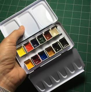
The Schmincke 12-colour metal sketching palette
set up with 12 half pans of Daniel Smith watercolours.
This is the Schmincke palette, available empty, designed to hold 12 colours, but you can easily add another 2 into the metal holding plate. A very similar version is also available for around US$15 or AU$25 (Art Basics from Art Scene in Australia.)


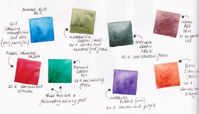
This gives you the option of adding 2 more of your own chosen colours at some time - another blue, such as phthalo blue; a deep green such as perylene green, a convenience orange such as quinacridone sienna; an earth red such as Indian red (which is excellent for brickwork and certainly one I'd add), a convenience purple such as Imperial purple - whatever you wish. I also love the mixing pair phthalo green and pyrrol crimson or Undersea green for Australian foliage. The point is, it's up to you.
Possible additional colours to personalise a 14 or more colour palette


A metal 12-pan palette st up with 14 half pans

Here I have set it up with space for perylene green (or phthalo green, or undersea green) and Indian red (or burnt umber). The half pans can be moved around easily, or stuck more firmly into place with blu-tac or you can stick magnetic strips to the bottom of each pan. 
If your collection grows, as they often do, the whole internal metal tray can be removed so either 18 half pans and a travel brush, or 24 half pans, or a mix of whole and half pans can be added to create a personalised palette. You can see a lot of other palettes on my website here.

Happy sketching!


Blues

$
0
0
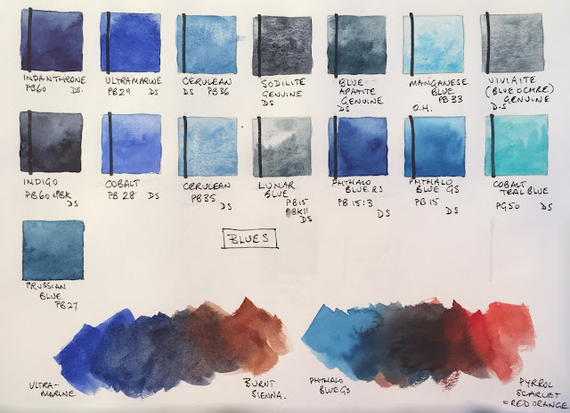
There are many wonderful blues. They vary in intensity, temperature and characteristics. In our blue week we had a fabulous range of blue objects to draw and paint and once again created the shadow colours by adding the opposite, orange. 

Burnt Sienna is of course a neutralised orange and a classic mixing colour with ultramarine. What is more surprising is that the opposite of phthalo blue is really a red - pyrrol scarlet or another warm orange-red - as phthalo blue is such a greenish-blue. Who says mixing a blue and a red will always make a purple?

I have included the beautiful genuine Old Holland Manganese Blue here even though it is no longer very easy to get hold of. The soft colour and pretty granulation is lovely. I have also included some Daniel Smith Primatek blues. I love the texture of Sodalite and Blue Apatite Genuine. I generally use ultramarine, cerulean chromium and phthalo blue in my palettes, perhaps with the lovely Indanthrone blue, but some of the others are fun extras :-)
You can see many more blue watercolours on my website here.

Using Daniel Smith watercolour sticks to make palettes.

$
0
0

Daniel Smith watercolour sticks cost less than a 15ml tube of DS watercolour paint but are made with 1.6 times the pigment load so they are a very economical way to buy watercolours - particularly the primatek sticks which may be series 3 or 4 in tubes! Designed to be drawn with, they can also be cut up to create fast and convenient watercolour palettes, whether they are stuck into pans, half pans or directly into palettes.

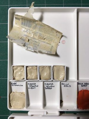
Here I have cut one stick of Buff Titanium into 5 pieces. You could cut it into 6 but 1/5th fills the half pan nicely. (For full pans use 1/3 of a stick.) I added a drop or two of distilled water to the pans to soften the watercolour stick and then pressed it in. I used one piece in a Masters palette as well. The very convenient part of setting up pans or palettes like this is that you don't need to wait for them to dry.

You could just cut 1/5th off the stick for a palette and keep the rest to use as a drawing stick. They work best in less humid environments - the do tend to soften in more humid environments.

If you are using tubes or watercolour to make up pans or palettes, make sure you shake the tube well before you open it and always open watercolour tubes cautiously - the paint can flow out very fast at times. Ideally, fill the pan half at a time and stir thoroughly to make sure the pigment and gum arabic are thoroughly mixed. Allow to dry in a warm place and you are set to paint.


What colour next?

$
0
0
I am setting myself a challenge. I made a palette that will have serious limitations, so that painting exactly what colour is there is not an option.

...like this range. There is not a bright yellow to make greens, or a true red, or pink to make purples. It will force some interpretation. It is also full of granulating and largely non-transparent colours.

I mixed Quin Gold with Goethite to create a brighter mixing granulating earth yellow. I mixed Burnt Sienna with Transparent Red Oxide to create a brighter Burnt Sienna. I chose Sodalite Genuine rather than Jane's Gery as a dark to add even more granulation, though it is also better for colour harmony since I don't have ultramarine in the palette (!)

It is based around a primary triad of Indian red, Cerulean chromium and the earthy yellow so it's a very earthy palette. Without Ultramarine, my basic blue, it'll be really interesting to paint with, especially wet into wet with a large brush.
But my little palette has room for one more colour. I considered adding Green Apatite Genuine or Serpentine for a granulating green, but chose one from below that I think will fit in best to keep harmony with the set. What would you add?

A 14-colour Granulating Earth pocket palette

$
0
0
Following on from the previous post about a 7-colour earth palette, I looked at the 'extras' I carry in my little Pocket Palette. (Note all watercolours are Daniel Smith)

I normally set it up with 14 of my Ultimate Mixing Colours as picture left (more information here and here), but my 'extras' version had hansa yellow light, phthalo blue RS and pyrrol scarlet (since they are not in my regular palettes and I sometimes need to demonstrate them) and a whole pile of earthy colours - almost a perfect earth palette in fact.

It had a number of pigments that I love for different reasons, and may want to paint with along with my regular palette - the basic 20 colours that I generally use. The yellows in my regular palette are Hansa Yellow Medium, Quinacridone Gold, Goethite and raw umber.


The extras were -
yellow ochre - which I like to use for landscapes or portraits
raw sienna - which mixes into a grey rather than a green with blues - good for skies, though also for skin-tones
transparent red oxide - which I love for its gorgeous burnt orange colour and crazy granulation
piemontite genuine - which is fabulous for rusty effects with transparent red oxide
cobalt blue - which is a beautiful colour that I don't use much (outside Santorini!) and want to get to know better
cobalt turquoise - which is lovely for copper effects and the sea
green apatite genuine - which is gorgeous for foliage, and is a multiplicity of greens in one pigment
serpentine genuine - which is perfect for grassy meadows
graphite - which intrigues me, though I don't often use it...
sodalite genuine - which has a little deep blue colour but lots of granulation
lunar black - which is the only black watercolour I use - fantastic granulation and texture

I wanted of keep most of these colours in their natural form, so they are still available when I need them, but turn the palette into a full stand-alone granulating earthy palette to paint with rather than just an extras palette.

So I added buff titanium, Indian red and cerulean chromium from my regular palette, instead of the hansa yellow, pyrrol red and graphite grey. I have also added the gentle potter's pink that is a long time favourite of Liz Steel that I have rarely used, as a granulating dusty rose (instead of the powerful phthalo blue RS that would overpower this new earth palette). It will mix gentle purples with cobalt blue. Purpurite genuine was another possibility here.


Cobalt blue is arguably too bright for this palette, and Blue apatite genuine would be a very fitting alternative, but I do want to get to know cobalt blue better so it is staying :-)

Outside the 14-colour palette paint-out, you can see that up the top I have also painted the lovely earthy mix of Quin Gold and Goethite, (I guess that would be Jane's Granulating gold :-) and the mix of Transparent Red Oxide and Burnt Sienna (Jane's Sienna) that are both in the 7-colour palette I posted about here.

Below are Graphite Grey, Hematite Genuine and Jane's Grey, which are alternatives for the dark colours, with VanDyck brown over on the right.

If I were suggesting a 12-colour granulating earth palette, it would have my Granulating Gold mix instead of Yellow Ochre and Raw Sienna, my burnt sienna mix, Indian Red alone (without Piemontite or Potter's Pink) and a deep granulating brown such as Van Dyck Brown instead of Lunar Black. Though of course Blue apatite genuine and Jadeite genuine are also gorgeous :-) The basic triad of a yellow earth, Indian red and cerulean are the starting point. How many you add to it is all about personal taste and what other pigments you happen to have or to like.

Now it's time to go out and paint with my new granulating earth pocket palette...


I went to a park in Rozelle and chose to paint the rocks on the shore. Not a challenging subject with an earthy palette I'll admit! It worked fine, but don't like to be missing Jane's Grey from my palette. Sodalite is interesting but not actually as versatile as my grey mix. Nor do I like missing ultramarine to be honest, even though cobalt blue works in a similar though gentler way. Nor quinacridone gold or goethite. So what have I learnt? That I am very stubborn! I have favourites because I love working with them. Why change? It's important to experiment and test things out, even if one returns to the status quo.

I'll keep my earthy 14 colour palette made up of course, but will continue to use them as extras to my usual set.


Greens

$
0
0
I missed out on a week of turquoise, which would have been the next logical colour, but added it in later. There's a fine line between a greenish-blue and a blueish green - when do they become turquoise/aqua/teal? And it's the same with the opposite of turquoise - a red-orange vs an orange-red, though there is no name for the in between colour.

There are many mixed greens available but I focussed here on more of the single pigment greens. I love the granulation of the Daniel Smith Primatek colours Green Apatite Genuine, Jadeite and Serpentine Genuine. I included DS Undersea green, even though it is a two-pigment mix, since it is one of my favourite convenience greens. I also included the DS Sap green - and other lovely useful hue.  Chrome green is an interesting more opaque green - not one I've used very often though I like it. Rare Green Earth is only just a green shade of grey - a gentle landscape green, that could be used in distant mountains in a landscape.
Greens can be neutralised by adding a red, though whether a warm or a cool red depends on how yellow or how blue the green happens to be.

For more greens, see my website here.

November update

$
0
0
I have been a little quiet here lately. I had a fabulous trip to the UK in July, which I started to write about, including teaching a 5-day workshop in Bath and teaching at the Urban Sketchers Symposium in Manchester. I had another really enjoyable and varied trip to New York and Montreal in September/October. I'll add more on them later.

I have done a couple of interviews. Part of one has been published here: http://www.artistsnetwork.com/medium/watercolor/10-essential-watercolor-tips-jane-blundell

I have also done some sketches of course, some of which I have added to my Facebook Page Jane Blundell Artist, or to Instagram janeblundellart.

In between, we have bought a new house and sold the house we've been in for 12 years - the longest I have ever lived in one place. We are now in the process of repainting the new house, then moving. We are going little more that 3km away, still in Sydney, but it requires packing up our lives...again. In the process, we are trying to reduce the amount we own...

Once we move, my goal for 2017 is so get my online lessons onto a more accessible platform, add videos to my own YouTube channel and get my next book completed. Its working title is 'Working With Triads' and it will be a great companion book to The Ultimate Mixing Palette: a World of Colour.

I'll be enjoying the sunsets we'll see from the new house, which may well inspire some paintings :-)


All that Grey...

$
0
0
Happy New Year. It's been a busy time getting our new house sorted and I still haven't unpacked everything I need in my art room - including my scanner - so please excuse the less than ideal photos. I wanted to share some ideas with you...

Back in 1999, when we lived in New Jersey, USA, my then very young son looked out the window one very grey February day and said plaintively "I wish that the world was all the colours of the rainbow."

While those of us in the Southern Hemisphere are getting our massive dose of vitamin D and watching out for the extreme UV over the Summer, for many of you this time of the year is all about grey - grey skies, grey roads, grey trees, grey buildings. There are many ways to mix greys and I thought I'd share a few.

Jane's Grey mixture

I am sure you will be familiar with my favourite grey mix - Jane's Grey. I generally prefer to create two-pigment greys since they are simple and can easily be moved between the two colours without any loss of colour harmony.

A cool dusty grey


Burnt Sienna and Cerulean Chromium is another lovely grey - I use this for dusty greys especially in the sky in the northern hemisphere if the grey is rather cool. It is granulating and liftable so, like Jane's Grey, you can splash it around and lift out the clouds.

A cool staining grey


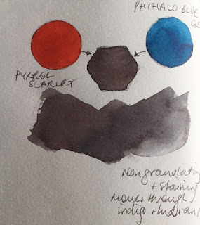
Pyrrol Scarlet and Phthalo blue GS will also make an interesting range of greys and near-blacks, but these will be non-granulating and staining. Where the above mixes can move between blues and browns, this will move between deep indigos and indian red hues. It will also mix darker greys than the above.

A neutral staining grey


Another favourite two-colour mix is phthalo green BS and Pyrrol Crimson - at full strength this makes Jane's Black - a wonderful deep staining black. But it can be watered down to a very soft range of greys. It can lean towards the deep maroons or deep greens so can be useful for foliage and landscape greys and blacks.


For a greater range of greys, try mixing three primaries together.


Granulating greys.

A lovely general purpose primary triad consists of ultramarine, Quinacridone Gold or another warm yellow (New Gamboge/Hansa Yellow Deep etc) and Pyrrol Crimson. This is a very useful triad in Australia as it mixes slightly dull greens, oranges and purples that suit our landscape. This triad will also mix a rich black that can be watered down to a lovely granulating grey. As there are three pigments in the grey, it can also be moved to a more purplish grey, a more green-grey, a more brown-grey or of course more blue, more yellow or more red. That adds complexity in mixing but is fun to explore.


A versatile range of greys.

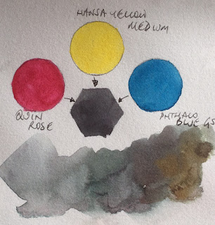
If you start with a cool triad - phthalo blue GS, Hansa yellow light (or medium as a pirmary yellow) and Quinacridone Rose - you can also mix a gorgeous rich and staining black. Watered dow, this will make a range of soft greys that can be adjusted warmer or cooler as you prefer.


Warm greys


A rather classical triad of a warm red, a yellow and ultramarine will also make a rich black, and watered down the greys will be granulating. They will tend to be warmer greys too.


Brown-greys


Phthalo blue, Quinacridone gold and pyrrol scarlet make another deep black but the greys tend to be difficult to neutralise if you add the yellow - alone the scarlet and blue make a rich neutral black as seen above.


My favourite granulating earth greys


One of my favourites is the grey made with Cerulean Chromium, an earth yellow such as Yellow Ochre and Indian Red. This will be a granulating grey and rather lovely to explore for snow.


Versatile granulating greys


Ultramarine,  Hansa Yellow medium and Quinacridone Rose is one of the most versatile primary triads - you can make pretty much any colour with this set. Mixed together they make a lovely rich black and a range of beautiful greys.


To make blacks and greys with any primary triad, I suggest making a mid orange first, then gradually add the blue. You could equally make a green and add the red or make a purple and add the yellow, but making the orange and adding the blue seems to be the most reliable method. And of course use very strong pigments with very little water to get a rich black.

You can read more about three-pigment greys on Liz Steel's blog - she uses three colours to make her premixed greys, including her new soft grey, which is a little like the earth grey above.

Enjoy your greys :-)

10 years x 10 classes Urban Sketching world wide workshops

$
0
0
For the first time, the Urban Sketchers organisation is offering long term workshops, all over the world. We'll have a series of 10 workshop classes created in a range of cities to celebrate 10 years of the Urban Sketchers organisation. While each series of classes is different and will be taught by different people, they all follow the same idea of little stories, medium stories and great stories and are each designed around the city in which they will be held.

Some will be taught by a number of instructors, some by just one.

Here's the detail - check them out and get them booked into your diary :-)

http://www.urbansketchers.org/p/10-years-x-10-classes.html

Watercolour Sticks from Daniel Smith

$
0
0
I wrote about making palettes using Daniel Smith watercolour sticks here.

I thought I'd add some more information, with photos, since I have noticed that watercolour sticks are now more readily available, including in Australia :-)

Here is my collection of watercolour sticks after my trip to the US last year. Some I have cut down to add colours to my students' palettes, some to add to my own palettes. I guess you could use them straight from the stick and not put them in a palette at all but that certainly isn't my suggestion. Once there is only 1/5 left of a stick I press it into a half pan, and, of course, write on the side what colour it is in a permanent pen.

20 colours - buff titanium, hansa yellow light, hansa yellow medium, quinacridone gold and hansa yellow deep - not that you need all four; organic vermilion, quinacridone red and permanent alizarin crimson; ultramarine, cerulean chromium and phthalo blue GS; phthalo green BS, undersea green, sap green and serpentine genuine; yellow ochre, burnt sienna, piemontite genuine, burnt umber and sodalite genuine.


My 'travel sticks' ready to go again.
Three half pans made up with 1/5 of
a watercolour tube squished in.
With watercolour sticks, unlike tube colours, there are no lids to screw on, no tubes to worry about leaking and no need to declare as liquids as part of your on-board luggage - they are very travel friendly. Though they do need to be stored in a dry container and can, of course, dirty each other if allowed to rattle around loose in a pencil case. They are formulated with the same ingredients as the tube colours, though with more pigment and less water so the drying has already been done. Even if you are not travelling with them, the ease of making up palettes is apparent. You simply cut off 1/5 of a stick and press in into the palette or pan. Done.

The only disadvantage is that you can't make up custom colours with them.

Note, though they were designed to draw with, I don't choose to use them for drawing. This is in part because I prefer to work with pencils and pens, but it is also because I live in a humid climate and I find they go soft so are not suitable for drawing where I live.

You don't need all of those yellows - I'd suggest hansa yellow light and hansa yellow deep (or you might prefer hansa yellow medium and quinacridone gold.)

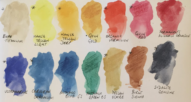
Here's the set of 14 painted out, including three of the yellows, three reds, three blues and some lovely earth colours. Sodalite genuine is a dark blue pigment that is very similar to my Jane's Grey. I scribbled on the paler with the sticks and brushed water over them, though in the palette you would just touch a wet brush to them as with other watercolour pans.

A basic palette of 14 colours using watercolour sticks. Or switch out one of the yellows and add Piemontite as an earth red.


And here are some of the gorgeous extras.
Serpentine genuine is normally an expensive colour in a tube but all the sticks are priced the same. I love it for grassy meadows.
Undersea green is a wonderful olive green that works beautifully in Australia as it perfectly captures our dull gum leaves. It can be a distant green too, watered down for atmospheric effects.
Sap green works the world over as a convenient realistic foliage green - add more light yellow to brighten it up further.
Piemontite genuine is an earthy red. Really lovely with yellow ochre and cerulean chromium as an earth triad. Indian red has more colour but isn't available as a stick.
Burnt umber is a colour that I like to have as a pair with raw umber (also not available as a stick). It isn't an essential colour since you can create this hue by mixing a little ultramarine with the burnt sienna, but it can be useful to have convenient darks.

Lovely extras.
The 12 colours that are asterisked are a suggested 12-colour sketching palette if just using watercolour sticks.

An finally an 18-colour palette option.

Happy travels :-)


MAC palette as watercolour palette - all my favourites - can you guess what they all are?

$
0
0
There are many hundreds of different watercolours available, made with hundreds of different pigments and pigment mixtures. Over many years, I've been exploring the various pigments and colours available to find the ones I think are the most interesting and/or generally useful. 

I have a rather large collection of tubes and many are squeezed into more portable storage palettes, and of course I have my painting palettes. Here I thought I'd go through my favourite watercolours, and explain why I like them. I don't necessarily paint with them all and of course never in one painting!

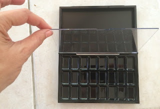
I was looking for a large palette that would hold many different pigments. I didn't need a mixing area in this one, as it was not for painting, but for demonstrating and explaining the differences between various colours and pigments. So I didn't look in traditional watercolour supply stores, but makeup stores. MAC makes empty pro palettes for makeup artists to fill with lipsticks. They are rather flat wells, so don't hold a lot of paint, but they don't need to. They are inexpensive, another bonus.

I bought a 24-colour lipstick palette. You could, of course, spray the lid section white and use this as a painting palette of 24, but I bought an extra 24-colour insert, creating a 48-colour storage palette.

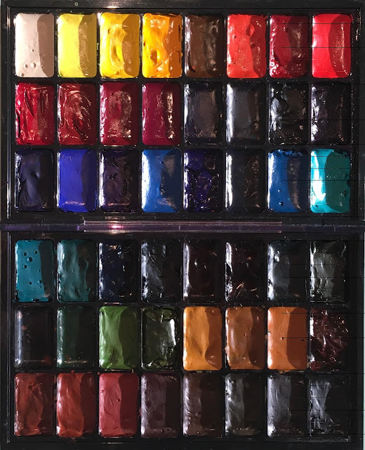
Here it is filled with my favourites. Some of you would be able to make a pretty good guess at what colours are here. 

But I won't leave you totally in the dark about what they are - here's a paint-out of the top section. I've now updated this post with the full palette names but just cover the caption to test yourself :-)

Top row: buff titanium, hansa yellow light, hansa yellow medium, new gamboge PY153 (very like hansa yellow deep), quinacridone gold, Da Vinci benzimida orange deep, transparent pyrrol orange, pyrrol scarlet.
Middle Row:Pyrrol crimson, carmine, quinacridone rose, Schmincke purple magenta PR122, imperial purple, moonglow, sodalite genuine, indanthrone blue.
Bottom row: ultramarine, cobalt blue, phthalo blue red shade, cerulean chromium, phthalo blue green shade, blue apatite genuine, Old Holland manganese blue genuine, cobalt teal blue


And here is the bottom section. There is one spot empty. It's probably the spot for Potter's Pink. Not a colour I use a lot, but a rather beautiful pigment. I'd have to rearrange the colours to put it in though...

Top row: cobalt turquoise, viridian, phthalo green BS, jadeite genuine, Jane's black (pyrrol crimson + phthalo green BS), perylene green, undersea green, green apatite genuine.
Middle row: blank, sap green, serpentine genuine, rich green gold, yellow ochre, goethite, raw sienna, quinacridone burnt orange
Bottom row: transparent red oxide, burnt sienna, piemontite genuine, burnt umber, raw umber, Jane's grey (ultramarine + burnt sienna), Lunar black.

Of the 47 colours, 42 are Daniel Smith, 2 are my own custom mixes using DS paints and 3 are other brands - a Da Vinci, and Old Holland and a Schmincke.

I haven't included any cadmiums, even though they are excellent pigments with specific uses. I have them in my other storage sets!

Well done to Bob who pretty much nailed the guessing below :-)


A bit more detail...

$
0
0
 I've been asked for more detail about the colours I showed in the MAC Palette of my favourite watercolours last post. Here is what I like about each of them. I don't for a minute suggest anyone needs all these in their palette - some suit a small or limited palette, others are just fun for a special purpose. Some I only have so I can demonstrate the differences between similar hues. But of the hundreds of watercolours I've tried, these are the ones I think are particularly useful or special. So this is my sample palette for teaching.

While most are Daniel Smith since they are the paints I have been using for over 20 years, there are similar colours and/or pigments available in other brands for some of these, others are DS exclusives. I have made my Ultimate Mixing Set bold, and my favourite 24-colours for my own palette italic (so many are both

I usually have an 'extras' palette, even when plein air, in case I want the wonderful properties of one of the Primateks or other pigments. I have said many times - watercolour is not just about the colour - they can be mixed from a very small selection - it's also about the properties of the pigments :-)

The first row.

  • Buff titanium DS PW6:1 a granulating and slightly unbleached white opaque watercolour great for urban sketching, sand effects, sandstone, marble and gum trees. This is one of my most used colours.
  • Hansa Yellow Light DS PY3 - a very pure and bright cool yellow. I don't use a cool yellow much, but this is a great choice if you want one as it is relatively transparent and mixes beautifully. I have this to demonstrate, and put a cool yellow in my students' palettes.
  • Hansa yellow medium DS PY97. I use this as my main yellow. It's a mid or primary yellow, but so much more lightfast than aureolin (PY40). It's a great pair with quinacridone gold.
  • New Gamboge DS PY153 This has been reformulated, but I have some old stock. Very similar in hue to Hansa Yellow Deep, with is another excellent choice for a bright warm yellow - a great pair with hansa yellow light.
  • Quinacridone Gold DS PO49 I love this slightly neutralised warm yellow as a great mixing gold. It makes wonderful greens with any blue or with phthalo green, and adds a glow to a painting. Only available in DS 15ml tubes, though the mixed hue in the 5ml tubes and sticks is also very pretty.
  • Benzimida orange deep PO36 DV. Da Vinci make excellent watercolours, including many in 37ml tubes. This is one of my favourite single pigment oranges. It's very bright, semi transparent and mixes beautifully with blues for neutrals. 
  • Trasparent pyrrol orange DS PO71. I love this as a very transparent warm red option. It's a little more tricky to use than pyrrol scarlet, the warm red I recommend, as it has more of a drying shift. But it is gorgeous as an orange wash under red fruit and flowers for more brilliance
  • Pyrrol Scarlet DS PR255 This is possibly the most beautiful warm red I've used. Really bright and mixes nicely with yellows to make bright oranges or interesting neutrals with phthlo blue


Second row

  • Pyrrol Crimson PR264 DS is a powerful crimson. I love it alone or mixed with phthalo green to make a fantastic range of deep greens, maroons, greys and a rich black.
  • Carmine DS. This is one of my favourite primary red options in a limited palette - it is a lovely crimson but also mixes clean oranges and purples. Quin rose is cleaner still, so is another excellent primary red.
  • Purple Magenta Schmincke PR122. Daniel Smith have just released a PR122, which I haven't yet tried. It is probably the closest to a primary magenta as found in a CYM palette. It mixes clean purples and clean oranges. However I don't like the basic magenta colour as much as the basic rose colour so I prefer Quinacridone Rose as my purple-mixing red.
  • Quinacridone Rose DS PV19. This is another great primary red choice, and the colour I use to mix purples. Transparent and beautiful, is is useful for skin tones, florals, mixing and so on. One of my key mixing colours.
  • Imperial Purple DS PV19 + PB29. While this is a very easy purple to mix using palette colours, sometimes it is useful to have a convenient premixed purple and this granulates nicely. As it is made from two basic palette colours, I can always use it without any loss of colour harmony. The alternative PV23 purples are more staining though useful if you don't want granulation.
  • Moonglow DS PR177+PG18+PB29. This is a really interesting purple-grey with fantastic granulation. It is gorgeous in the shadow areas of florals and as I don't tend to have viridian in my palette it is a difficult one to mix myself on the go. Not used often, but I do love it.
  • Sodilite genuine DS - this is a lovely granulating blue-grey. Similar in hue to my Jane's Grey but even more granulating.
  • Indanthrone Blue DS PB60. This is one of the most beautiful rich deep blues. It has a little drying shift but is a powerful deep warm blue option. I use ultramarine more, but this is gorgeous for a night sky or stormclouds.

Third row


  • Ultramarine Blue DS PB29. There is also French Ultramarine, which is ever so sligthtly more red and more granulating, but I use the series 1 ultramarine as it mixes perfectly with Burnt Sienna to make my Jane's Grey. This is a basic palette colour for me. Great for skies, for mixing a range of greens or purples, and for use as a lovely non-staining warm blue.
  • Cobalt Blue DS PB28. I love this colour, though I won't often use it. I use ultramarine more as it is more on the purple-side so gives a more versatile warm blue. Cobalt is a mid blue - neither warm nor cool - and would be lovely in a limited palette with hansa yellow medium and Quinacridone Rose.
  • Phthalo Blue Red Shade DS. I love the way this mixes with Transparent Pyrrol Orange. It can also be the exact colour of the Australian sky. However I tend to recommend the Green Shade for a greater mixing range.
  • Cerulean Chromium DS PB36. There is also a cerulean made from PB35 but it is not as strongly pigmented nor as cool. I love this for sketching - with ultramarine you can mix a blue-sky colour for anywhere in the world. Being non-staining, it is easy to lift out the clouds.
  • Phthalo Blue Green Shade DS. A powerful, transparent and staining cool blue - excellent mixer and great for glazing. It's a basic palette colour though I tend to use it more for mixing than painted alone.
  • Blue Apatite Genuine DS. I really love granulation. I don't use this much, but I enjoy playing with it :-)
  • Manganese Blue Old Holland PB33. Though now discontinued, this lovely gentle blue has exquisite granulation. It's perfect for the sparkly shadows of snow in some lights, though not for Australia sadly. I don't use it much but have a little stock of this now difficult to get pigment.
  • Cobalt Teal Blue DS. I don't actually paint with this, but have it in this palette to show the difference between it and my preferred Cobatl Turquoise below. It's a gorgeous colour, and I'd take it to New Zealand to paint the colour of the water in the rivers, but it's often just to unrealistic for me.
Fourth row.

  • Cobalt Turquoise DS PB36. This is the same pigment as ceruelan chromium and it has the same semi opaque and heavy granulating characteristics. I use this in water, for creating copper effects and for extra granulation. A lovely extra.
  • Viridian PG18 DS. This is a much more gentle cool green. It won't mix the powerful blacks you can make with phthalo green, but the granulation is lovely. I don't use it much, but keep it more for comparisons.
  • Phthalo Green Blue Shade PG7. This is a colour I don't use alone, and suggest you simply don't when painting from life as it is such an unrealistic green. It's a great mixer though, making spectacular greens with a warm yellow or many of the earth colours.
  • Jadeite DS. This is a great alternative to phthalo green if you want more granulation and texture. A lovely colour that changes mood whether applied in a wash or deep masstone.
  • Jane's Black PG7 + PR264. This is another custom mix I make to have a rich deep black without using a black pigment. Made from Pyrrol Crimson and Phthalo Green to a neutral deep black.
  • Perylene Green PBk31 DS. This is one black pigment that I use. I love this deep shadow colour for the shade between trees, the deep green in foliage and the lovely greens it makes when mixed with yellows. convenience darks save time when painting.
  • Undersea Green DS PB29 + PO49. This is an old tube as the new formula is a three-pigment mix, but I find it a very useful green for foliage in Australia and overseas.
  • Green Apatite Genuine DS. This is a lovely granulating green, similar to Sap green, that gives surprising results. Fun to play with. (lives in my 'extras' palette)

Fifth row

  • blank - the 48th pigment I may add to this set is Potter's Pink. Or perhaps a single pigment granulating violet - I usually mix my purples but PV14, PV15 and PV16 are interesting... though it means moving a lot of colours in the palette...
  • Sap Green DS PO49 + PG7. This is another old stock Sap Green (I bought a lot when they were changing the formula) and it is a perfect premix for foliage and leaves throughout the world. Having a convenience 'home green' can really be helpful when painting, especially on location.
  • Serpentine Genuine DS. This is a beautiful extra - perfect for a field of grass. I don't use it much, but the lovely specks of brown that appear as it dries are just gorgeous. (Also lives in my 'extras' palette)
  • Rich Green Gold DS PY129. A very green-yellow, useful for foliage when the light is shining through the trees. Not an essential colour, but I use it in plain air palettes of 24 colours.
  • Yellow Ochre PY43 DS. One of three earth yellows - this will mix great sap greens and is lovely in an earth primary palette. 
  • Goethite DS PY43. My most used earth yellow - I love the granulation, and the way it creates sandstone, beaches and other textures with such ease. I mix this with Quinacridone Gold for a gorgeous granulating gold earth.
  • Raw Sienna PBr7 DS. This is a slightly more orange yellow earth, but it mixes quite differently from yellow ochre, making it useful to have both.
  • Quinacridone Burnt Orange PO48 DS. This is a lovely colour that creates and incredible range with phthalo blue, but I don't use it much. i keep it as a comparison with burnt sienna and transparent red oxide.
Sixth row


    • Transparent Red Oxide PR101 DS. I just love this colour. It's a brighter, more orange and more wildly granulating pigment than burnt sienna. I like to have both in my palette - this for rusty effects, the burnt sienna for a more subdued colour.
    • Burnt Sienna PBr7 DS. A basic palette colour, this is a perfect hue to wash down to a skin-tone with lots of water, and to mix with blues for lovely greys. 
    • Indian Red PR101 DS. This is the most opaque watercolour, but that doesn't mean it can't be used with lots of water for lovely granulating effects. I love it with yellow ochre (or my mixed granulating gold) and cerulean chromium for a gorgeous earth primary palette.
    • Piemontite DS. There is a surprising soft dusty pink in washes, with a deep red-brown in mass-tone - this is perfect for rusty effects, along with transparent red oxide.
    • Burnt Umber DS PBr7. It's not an essential colour as it is easily mixed, but in a 20-colour palette I like to have burnt umber as a convenient warm brown.
    • Raw Umber PBr7 DS. This is more difficult to mix, and varies considerably from manufacturer to manufacturer. I love this cool deep brown, which is more difficult to mix. It's one of my ultimate mixing set.
    • Jane's Grey PB29 + PBr 7. A convenience mix that I make up 60ml at a time. It is granulating and liftable so perfect for skies, shadows and works as a neutral tint to darken other colours. A basic palette colour for me as it saves time when painting.
    • Lunar Black PBk11 DS. I don't tend to use black pigments but this is an exception as it is exceptional in its granulation. It creates incredible patterns as the pigment floats and moves - such fun :-)


    Getting organised - are you a paper diary person?

    $
    0
    0
    It's funny how it can take the first month of the year to get organised for the rest of the year. I've been checking through my diary and notes from last year to carry over the (rather too many) unfinished tasks I had hoped to achieve. Moving house takes a lot of time!

    I have noticed that I need the next year's diary by about August to start getting things planned, and they are not usually available until October, so I have been making my own. My favourite book is the Leuchtturm1917 dotted format book. I've been using an A6 sized diary for years with an additional notebook but have gone for the larger A5. There are enough pages (249!) in this one one to combine my diary and notes into one book, and enough space to really plan what I will be doing.

    I like some of the ideas of the Bullet Journal, where the diary/journal is drawn out over the course of the year in an otherwise blank book, but can't stand the idea of not actually having a full diary to refer to and write in directly. I also like to have each year in a book. Not surprisingly, for one who loves paper and pens, I have never switched to an electronic diary :-)

    I draw mine out for the full year with each week over a double page spread, divided into 8. The first section is notes and planning for the week, the other 7 are for each day of the week. It's rare to find a diary that actually had this very practical arrangement in this size. So many have little spaces for the weekend days - which is crazy as these are often the busiest! (Note - there is one that does, and I used it for a few years - made by Kikki.K but I don't use the monthly spreads, and there are not enough extra note pages in that.) Like my palettes, I just prefer to do it myself to get it the way I want it.

    In between each month I have a double page for monthly planning. Not ruled up, just space for goals, notes etc. This format gives me the full year structure, then plenty of pages of notes to organise my other lists and ideas.

    What I particularly like about the Leuchtturm1917 from Germany is that the pages are numbered, there is an index section so you can easily find your lists and ideas, and the paper is fountain pen friendly. Add to that the dot format, which makes any ruling up a breeze, and the large number of pages and it's no wonder it's the most popular book for journaling. The last pages are perforated in case you need to tear them out, and there is enough space to be able to record everything you want in here - putting and end to piles of sticky notes.

    In Australia, Larry Post is probably the best place to get this, as they have a huge range, with the Bullet Journal version as well as blank, ruled and various sizes. Notemaker.com  is another good option.

    So what sort of diary system do you prefer?


    Viewing all 214 articles
    Browse latest View live