Quantcast
Channel: Jane Blundell Artist
Viewing all 212 articles
Browse latest View live

Urban Sketchers Symposium, Chicago

$
0
0
I'm delighted to be one of the 36 instructors on the teaching faculty at the 8th International Urban Sketchers Symposium in Chicago in July this year. I'm guessing there will be over 500 participants - it's an amazing experience having that size sketching 'flashmob' come to town :-)

It will be my third symposium. I loved demonstrating in Singapore in 2015, then teaching about colour in Manchester in 2016.

The workshop schedule for Chicago is here (http://www.urbansketchers.org/p/usk-symposium-programming.html) Choose your workshops and demonstrations before you register.

Registration is from the 11th February - get all set up in advance as it can be very busy on the day.

I'll be teaching a workshop called Drawing Out the Details.

I often like to draw small sections of a scene rather than the whole view, like this series of sections of the QVB in Sydney. It's a way to tell more about a place than you can in a single view.


 This is a series of sketches from a market in Montreal.


 And this series of sketches are in New York - in the Met and outside the Public Library.

I choose materials to sketch with that will be most suitable for the subject - sometimes a water-soluble pencil to show a softer subject, sometimes a pen, sometimes black ink, sometimes grey or brown. During the workshop I'll be sharing sketching tips and techniques while exploring a range of sketching tools to build a montage of a scene by drawing the details.

Here's a sketch of  some of my favourite sketching tools. I'll have a number with me for participants to try - it's always best to try things out before you buy them and add them to your kit :-) For full information about all these tools see my in blog post.


I'll also be doing a demonstration about how to choose a great sketching palette. More details of the demonstrations are here - all participants can choose one. Workshop participants choose four workshops as well. So much fun! See you in Chicago :-)


The Portable Painter palette - up close and personal

$
0
0
I received a couple of Portable Painter palettes - an Indiegogo kickstarter project - and have set one up to play with it. It's an improvement on the W&N Cotman palette that many buy (and replace the paint with artist quality) as it has a larger brush space and more mixing areas. It also has the two water containers that act as a container or box when transporting, or as a stand so it can sit on your leg or another surface when sketching. It comes with 12 half pans - custom pans, though the universal ones will fit very tightly - but I set it up here with the paint directly in the wells. Only do that if you know you won't want to change the colours around!
The Portable Painter palette.

Here are the colours painted out, though in a different order from what you see above. This is my suggested urban sketching set of 12. It contains a warm and a cool yellow, red and blue along with some very useful earth colours and a useful green. It also works very well for beginners in watercolour as there are no powerful and staining phthalo colours. More about this colour set here

my recommended urban sketching palette, set up with Daniel Smith watercolours. 

Here is one set up using the half pans that came with the palette. This time I have used my most used colours for urban sketching, rather than a more traditional recommended palette as shown above. It is set up as I usually do moving from lightest to darkest, through the rainbow. There is only one bright red - quinacridone rose - as I don't use a lot of red when sketching buildings and can mix the other red hues I want with this very useful cool red. I have also included Indian red though as it is so useful for brickwork. I love the earth colours and it makes a beautiful triad with cerulean chromium and goethite (with a touch of quinacridone gold for a little extra glow).

The Portable Painter palette set up with Daniel Smith watercolours

And here are the colours painted out. I really struggle to get down to just 12 colours. My Ultimate Mixing Set has 15. I normally work with 20 or 24. But this would work for me for urban sketching. I chose perylene green for this set rather than phthalo green as I don't have the crimson I'd normally have to mix this lovely shadow green. Perylene green also mixes great greens with the yellows in this palette.

My 12-colour urban sketching palette - buff titanium, hansa yellow medium, quinacridone gold, quinacridone rose, ultramarine, ceruelan chromium, perylene green, goethite, burnt sienna, indian red, raw umber, Jane's grey. All Daniel Smith.
This set includes the earth triad mentioned above, a very useful almost primary triad of hansa yellow medium, quinacridone rose and ultramarine, and a cool triad of hansa yellow medium, cerulean and quinacridone rose. Goethite, burnt sienna and ultramarine also work beautifully for limited colour studies.

Happy sketching :-)

Quick demonstrations

$
0
0

I've been doing a lot of sorting lately, since moving into a smaller house. It's a good chance to assess what is useful and what is not and reduce the clutter. I thought, however, that some of the things that I don't need to keep may still be useful, so I took a few photographs before recycling these pages. 

When I am running workshops and doing demonstrations I do a number of pages of quick studies and sketches and though they are not carefully finished, they still show what I was explaining. I've selected sections of a few pages to share here.

Anyone familiar with my work will know about Jane's Grey. Here's a quick demo of the mix. I don't suggest for a moment that you don't also explore the gorgeous range of hues you can create mixing ultramarine and burnt sienna on the palette or on the paper, but as a pre-mix it's incredibly useful.
Jane's Grey mix.
Jane's Black mix.
Jane's Black is another favourite mix. Whereas Jane's Grey is a deep slightly blue-grey that is granulating and liftable, Jane's Black is non-granulating, staining and a neutral black - neither looking red nor green. It washes out to a neutral grey. It's very useful for passages of very dark hue - whales or penguins for example. 
My students are currently using it to create a tonal underpainting that will be glazed later with washes of colour.

Here is a demonstration about the various strengths I aim for in watercolour. Starting with a very thick (like cream) mix of watercolour - as shown on the bottom - I add a 'brushful' of water to create gradually lighter tones.
Determining tones in watercolour
The 'cream' mixture will move slowly on the palette, just as pouring cream would. The 'milk' mixture moves a little more freely, but is not as liquid as the 'coffee' mixture. Think of black coffee here - liquid but not at all thick. Then 'tea' is more diluted, just as black tea is usually transparent. The weak tea is exactly that - rather like coloured water.

As we are talking about watercolour, we must always add water - the paint straight from the tube needs to be diluted before use, otherwise it will do what is called 'bronzing' and dry with an ugly sheen.

This quick demonstration shows in a very immediate way what sorts of colour mixes can be obtained when working with a well-chosen warm and cool red, yellow and blue. Here I've used hansa yellow medium (which is strictly speaking a mid yellow, but works much the same as a lemon yellow) along with quinacridone gold (a warm but neutralised yellow); quinacridone rose and pyrrol scarlet as the cool and warm reds respectively and ultramarine and phthalo blue GS as the warm and cool blues. 

Mixing a warm and cool red, yellow and blue.
It's apparent that the greens vary greatly, more than the oranges, and that you can't make a purple with a cool blue and a warm red. 

I have many pages of this sort of sketch explanation. Do you want to see more? And if so, about any particular aspect of watercolour?

Top 60 watercolour blogs

$
0
0
I'm rather delighted to have been included in this list - you may enjoy many of the other blogs mentioned in the list here.


There will be others you know of that are not in the list - feel free to add them in the comments, perhaps saying what you like about them - so others can find them too.

Handmade watercolours

$
0
0

I painted out a lovely triad with DS yellow ochre, DS cerulean chromium and Sharlie's Pinkcolor deep - a gorgeous colour somewhere between Potter's Pink and Indian red - either of which could equally be used in an earthy primary wheel like this. I posted it on Instagram (Janeblundellart) but I wanted to give a little more information here.


I was sent some samples of some hand-made watercolours to try out. Sharlie also loves granulation and has been making a small quantity of each colour to test. As I have tested so many pigments over the years, there were not many that were completely 'new' or original for me, but her Lapis Lazuli is more beautiful than the commercial ones I have tried and I really like the Pinkcolour deep  - much more interesting then the usual very soft watercolour known as Potter's Pink. I guess I just prefer stronger colours - you can always dilute them. I also really liked the Moroccan earth colours and the lovely rich Maya Blue.

Here are the colours I tested out.


Making my own watercolours, like making my own sketchbooks, is something I have chosen not to do. I want to spend time sketching in the books or painting with the watercolours! However I really admire those who go through the effort of making their own. Sharlie's rewet and painted out very nicely, unlike some others I have tested.

She has an Etsy shop called biscuitswatercolor, where she sells half pans of handmade watercolour. I don't have an Etsy account so can't post a link. I believe she has a number of other colours besides these :-)

Handmade watercolours using Schmincke pigments

$
0
0
I recently wrote about some of Sharlie's hand made watercolours, which were a joy to try. She gathers pigments from all over the world and is making quite a range of colours so I haven't tried, or shown, them all.

I was told about, and then received samples of, Matteo Grilli's selection of 10 colours. Made in Australia! He is using Schmincke pigments and binder, and explains the process beautifully here

Matteo Grilli's 10 watercolours, as they arrived in the post.
Matteo Grilli's Indian Yellow, Raw Sienna and
 Ultramarine Blue Light
The colours are lovely to paint with, rewetting with ease, and very strong and richly pigmented. I painted out some swatches as I usually do. 

The first, Indian Yellow PY153, is a pigment that is not easy to find any more. It's a beautifully warm yellow that has been discontinued in most ranges so lovely to see it here. PY65 (Hansa Yellow Deep in DS; Arylide Yellow Deep in DV, Chromium Yellow Hue Deep (213 in Schmincke) is almost identical in hue, but just behaves a little differently.

Raw Sienna PBr7 is a lovely yellow earth option. It varies considerably betweens brands - in DS and DS it is more on the orange side. In Schmincke I am guessing this is perhaps used in their Raw Umber (667). They have just released a Transparent Ochre using PY42 (657) which is far more yellow.

The Ultramarine Blue Light lovely. Painted out with ease and has some granulation. Schmincke now have two ultramarines using PB29 - the familiar Schmincke Ultramarine Finest (494) and the new French Ultramarine (493).

Here is the Ultramarine again next to the Burnt Sienna. I love this combination and the Burnt Sienna is a beautiful colour! It is made with PBr7 and has a beautiful granulation with some flecks of other colours in it. It is the same hue as the Daniel Smith burnt sienna but more varied. It reminds me of the old Art Spectrum Burnt Sienna Natural that I used to love, but which was replaced with a hue :-(

Matteo Grilli's Ultramarine Blue Light, Burnt Sienna,
Raw Umber Greenish and amazingly deep Burnt Umber
Schmincke have just released this PBr7 pigment in their updated range as a colour called 'Maroon Brown'. They have also released a 'Transparent Sienna' PR101 which is like the W&N burnt sienna. And they have their original Burnt Sienna made with PR101 and PBk7 that I have never been interested in since I don't choose to use colours with black pigments in them. (The exceptions being perylene green PBk31, which I love, and DS Lunar Black PBk11 which I also enjoy for special effects :-)

The Raw Umber Greenish is a deep cool umber - similar to the DS or DV Raw Umber so a very useful colour. Schmincke has also released this pigment in a colour called Green Umber (665) but it isn't as strong as Matteo's version.

Burnt Umber is very rich and dark - this is the colour I think of as Sepia that would normally be made with a brown and a black pigment. Lovely :-) I think I'll have to buy some of this one...I haven't come across such a lovely deep Burnt Umber before...


Matteo Grilli's Carmine, Terra Pozzuoli,
Prussian Blue and Madder Red Deep
Carmine is PV19, and called Ruby Red (351) in the Schmincke range. A fabulous 'primary' red as it mixes so cleanly to make oranges and purples as well as bright reds. This is really pigment loaded and luscious.

Terra Pozzuoli is an opaque Indian red colour - really rich and lovely. It washes out to gorgeous flesh tones. I am fascinated by the many versions of PR101 that exist. It is one of the multi-personality pigments I will write about soon. Have a look at them all in my website here. I still have a number to add as well!

Schmincke used to have a Pozzuoli Earth colour that was more orange, but that seems to have been removed in the overhaul of their pigments this year. A similar colour to the Terra Pozzuoli in the new Schmincke range is Caput Mortuum (645) made with PR101 and PR206. Earth reds are terrific for earth triads - I love exploring them.

Prussian Blue PB27 is a rich, deep cool blue. I tend to mix this hue if I need it but Matteo paints gorgeous wildlife paintings using this as his cool blue. (491 in Schmincke)

Madder Red Deep is a very earthy red colour made with the very lightfast PR179 - also known as Perylene Maroon (366) and available from many manufacturers.


It is very special to paint with handmade colours. I bought 5 of Matteo's - a lovely palette of Indian Red, Carmine, Ultramarine Light, Burnt Sienna and Raw Sienna as they play so nicely together. I have added Cerulean Chromium (DS) and of course Jane's Grey to my limited palette of 7. But I just may need to add the Burnt Umber and Terra Pozzuoli too... Of course I explored the mix of Ultramarine and burnt sienna - lovely greys :-)


I'll be loading up the full range of Schmincke new colours soon, though you can see many of them on Instagram - just follow janeblundellart.


New Schmincke Watercolours 2017

$
0
0

The first professional watercolour set I bought over three decades ago was Schmincke. The pigments that were included in that set of 24 pans have been changed over the years, with 110 colours available in their most recent range up until this year. They are a very accessible brand as they come in 5ml and 15ml tubes as well as half and full pans. They also come in sets but tend to have some rather odd choices in them.

This year Schmincke have released 35 new colours as part of their 125 year anniversary revamp, changing some formulations, renaming old colours and expanding their range to 140 colours.

I haven't used them much myself in recent years as unfortunately two of the key colours I use - burnt sienna and ultramarine - have not been to my liking. The burnt sienna is PR101 with black pigment added and the ultramarine finest doesn't granulate much at all. So I am delighted with their decision to introduce a French Ultramarine  - a granulating version, and a new burnt sienna made without black. It uses PR101 rather than my preferred PBr7, but it's a step in the right direction. To be fair - I think it's terrific that there was a less granulating 'ultramarine finest' available for those who don't like granulation, I'm just pleased there is now a choice. There is another new colour called Maroon Brown that is labelled as NBr (whatever that is!) but that looks to me like a natural burnt sienna PBr7. It's gorgeous :-)


They have also released some dot cards, a Daniel Smith innovation that makes testing out colours so much better for those of us trying to choose them. Jackson's Art UK website has a great post about the colours here. To see the new colours in detail, there is a PDF here.


I get sent dot cards periodically of paints that people have that are missing from my website so was sent a few of the new colours before they were released in Australia. (Thanks Corinna and Ricarda :-) Then I was able to check out the rest of the colours at my favourite local art store Art Scene, so here is the full range of new paints painted out and photographed without adjustment.


New Schmincke colours 2017 - Rutile Yellow, Quinacridone Gold Hue, Turner's Yellow, Yellow Orange and Geranium Red.

  • Rutile yellow is interesting - it's a completely different version of the usual PY53. Rather like some versions of Naples yellow. 
  • The Quinacridone Gold Hue is close to the genuine colour. This is a good pair of pigments to make the hue.
  • Turner's Yellow ia also very opaque, like a yellow with white added. Interesting :-) It is richer than it looks on my screen.
  • Yellow Orange is more orange than it looks on my screen. It reads as an orange rather than a warm yellow.
  • Geranium red is the colour of geraniums - a bright red.

New Schmincke colours 2017 - Vermilion Light, Quinacridone Red Light, Perylene Dark Red, Ruby Red Deep and Transparent Red Deep.

  •  Vermilion Light is a coral colour.
  • Quinacridone Red Light id a slightly more pink coral colour
  • Perylene Dark Red is  rich crimson
  • Ruby Red Deep is a deeper stronger crimson - a great colour (like the Pyrrol Crimson DS)
  • Transparent Red Deep is more of a deep fire engine red.

New Schmincke colours 2017 - Saturn Red, Bordeaux, Quinacridone Magenta, Potter's Pink and Perylene Violet.

  •  Saturn Red is brighter and more vibrant than this looks on my screen - a lovely mid orange.
  • Bordeaux is very like Ruby Red Deep
  • Quinacridone Magenta is the same pigment as DS Quinacridone Magenta - slightly violet magenta. 
  • Potter's Pink is deeper than most versions. (I like this - saves me having to make any more Jane's Earth Rose!)
  • Perylene Violet looks correct on my screen.

New Schmincke colours 2017 - Quinacridone Purple, Cobalt Violet (no pigment number given), Phthalo Sapphire Blue, Cobalt Azure and French Ultramarine.

  • Quinacridone Purple is the same pigment as the DS colour.
  • Cobalt Violet Hue is granulating but no pigment number is given.
  • Phthalo Sapphire Blue is a warmer phthalo blue. It looks accurate on my screen.
  • Cobalt Azure is cerulean PB35 pigment. Nice and granulating and non-staining.
  • French Ultramarine is rich and strong - very nice.

New Schmincke colours 2017 - Viridian, Transparent Green Gold (Should read PY154 + PBr7) , Spinel Brown, Maroon Brown and Transparent Sienna.

  •  Viridian is never an easy pigment to paint with. This is not the strongest version of PG18 I have tried. It looks too blue on my screen.
  • Transparent Green Gold is a slightly dull olive green. I originally thought this was an unusual version of PY154, but I was missing the PBr7 that is also in the mix. It would have been better if they had used PY129 as then it would have been a single pigment green gold.
  • Spinel Brown made from PY119, which is also used in Manganese Brown by W&N. Lovely granulation :-)
  • Maroon Brown is labelled NBr (whatever that means) but it looks to me very like the Schmincke Burnt Sienna PBr pigment so perhaps it is a natural burnt sienna? I love it. Jackson's website labels it PBr7.
  • Transparent Sienna is a very earthy version of this PR101 pigment - not too bright. It actually looks like a burnt sienna rather than a Quinacridone burnt orange.

Transparent Ochre, Mars Brown, Green Umber, Transparent Umber and Mahogany Brown.

  •  Transparent Ochre is a staining ochre - it looks more yellow on my screen.
  • Mars Brown is like a burnt umber.
  • Green Umber is raw umber in many other brands. I really like to have a cool dark brown in my palette so this is a useful colour, but I would like to see it much richer and more heavily pigmented.
  • Transparent Umber is another Burnt Umber option.
  • Mahogany Brown is made with PBr33 - as was the now discontinued Walnut Brown. But this is far more interesting with lovely granulation and might wash out nicely for skin tones.

New Schmincke colours 2017 - Perylene Green, Graphite Grey, Hematite Black, Mars Black and Brilliant Opera Rose.

  •  Perylene Green is such a useful colour. 
  • Graphite Grey is nice and granulating.
  • Hematitie Black is made from a green pigment.
  • Mars Black granulates nicely though not as much as DS Lunar Black
  • Brilliant Opera Rose is certainly bright - until it fades.

The new colours are largely single pigment colours, and it's nice to see some lovely granulating colours among them. It's now possible to put together a lovely sketching set of single pigment colours :-)


New Daniel Smith Watercolours

$
0
0


New Daniel Smith colours. Photo from Daniel Smith (http://www.danielsmith.com/content--id-871)

It takes a little while for new colours to arrive in Australia but here they are - the new Daniel Smith colours released in 2017.

Daniel Smith Aussie Red Gold, Rose Madder Permanent (note this also has PR202), Quinacridone Lilac and Wisteria.

I've photographed my painted swatches but getting accurate colour reproduction is not easy. The Aussie Red Gold is more orange than it looks here - rather like a PY110 yellow - you can see it better in the photograph above. You can also read more about it on the DS page and see some interesting mixing charts. It's a lovely 3-pigment mixed orange-yellow that really glows. It uses the same pigments as the Art Spectrum Australian Red Gold. It creates extraordinary greens when mixed with blues - I've shown some mixes in little videos on Instagram (Janeblundellart)

The Rose Madder Permanent, Quinacridone Lilac and Wisteria are more accurate in this photo. Genuine Rose Madder NR9 is a lovely gentle granulating rose colour, but it fades. The DS hue mimics the soft value range of the original colour, using a mix of three pigments - PR209, PV19 and PR202 (I've labelled it incorrectly on my swatch).

Quinacridone Lilac PR122 is known as Quinacridone Magenta in many brands, Purple Magenta in Schmincke, as is a very welcome DS colour by all those who like to work with a CYM palette is PR122 is a fabulous primary red. It painted out beautifully. While I prefer to use Quinacridone Rose for the job of mixing gorgeous purples, I am really glad to see this pigment in the DS range.

Wisteria is made with PR122 and white.


Daniel Smith Lavender, Raw Sienna Light, Burnt Sienna LIght and Payne's Blue Grey.
Lavender is a popular mix available from other ranges. Some use cobalt, DS uses ultramarine, along with a violet pigment and white.

Raw Sienna Light is a single pigment PY42 yellow earth. It looks a little warmer in the flesh than this painted sample. (See photo above again)

Burnt Sienna Light is a mix of PR101 and PO48 - transparent red oxide and quinacridone burnt orange. It was released as part of the Alvaro set in 5ml tubes but is now available in the larger 15ml tubes.  It looks a little more earthy in real life than this photo.

Payne's Blue Grey is fairly accurate in hue. It uses the same mix of pigments as DS Indigo - Indanthrone Blue and black. Many Payne's greys are made with Phthalo blue and a black pigment.

New colours are always fun to explore. Happy painting :-)


A Rose by any other name...Rose Madder and Potter's Pink.

$
0
0
Rose Madder is a natural colour from the roots of the common madder plant called Rubia Tinctorum. It is a soft granulating rose colour, but it is not lightfast so should not be used for exhibition purposes or outside of a sketchbook or reproduction work.

As far I know only DS and W&N have the genuine NR9 pigment. I am rather glad they do - even though I don't choose to use fugitive paints, it's nice to be able to test them out to see what the hues are trying to replicate! The genuine versions in W&N and DS are the first two swatches below.

There are a number of hues available to replicate this delicate colour and I have shown three of them - Schmincke has a Rose Madder, Daniel Smith has just released a Rose Madder Permanent, Art Spectrum has a Rose Madder (Permanent Hue).

I thought I'd show them all together.


When you see the range of hue in the genuine NR9 between W&N and DS, it's easy to see why the hues also vary.  Rose madder was used for portraiture and as a cool red, often with the also fugitive aureolin and alizarin crimson pigments (one of which is included in the Schmincke hue)! These days quinacridone rose does a better job, but sometimes a softer colour is desired, and Quinacridone Rose doesn't granulate.

Another granulating soft pink is Potter's Pink or Pinkcolor made with a very reliable PR233. I've included the W&N, DS and Schmincke versions as well as some handmade watercolours to show the range of hues in this pigment too. 


I'd make a Rose Madder hue with the softly granulating Potter's Pink mixed with the more powerful Quinacridone Rose - I just might explore that mix some time. The PV19 pigment might float to the surface too much of course. It would be interesting to try with DS Rhodonite too. I do mix Potter's Pink with Indian Red to deepen it, and have shown that mix (Jane's Earth Rose) here. Sharlie's Pinkcolor Deep is similar.

A few more interesting rose pigments are the very deep Piemontite genuine, that can paint out to a soft rose colour, and some of the pipestone pigments.

Apparently the W&N Rose Madder smells lovely - a rose by any other name?


Schmincke Watercolours 2017 - full range

$
0
0


It is the 125th Anniversary of Schmincke Horadam watercolours, and they have been building up to a big release as part of an overhaul of their watercolour range. I've looked at the websites, dot cards, old and new charts to try to figure out the exact changes. Some colours have been removed, a number renamed and 35 new or replacements introduced to increase their range from 110 to 140 colours. I posted the 35 new colours here. Here is the full range, with thanks to Schmincke Germany and Art Scene Sydney. Where I have them I have also shown the replaced and discontinued colours but 4 of the discontinued colours are missing. Here is the link to the new Schmincke brochure.

These swatches have been photographed under 'sunlight' lamps, but some colours are still difficult to show - especially the warm yellows and oranges. Schmincke has a number of beautiful orange-yellows and bright oranges so it's a shame not to be able to show them better.

There are some excellent new colours but still a large number of two-pigment colours remain that are not strictly necessary. It's great to see some more granulating pigments, and a G has been added to the brochure information to highlight the more granulating colours in the range.

Schmincke Horadam Watercolours - Titanium Opaque White (was Titanium White Opaque), Permanent Chinese White, Titanium Yellow, Lemon Yellow, Cadmium Yellow Lemon, Chromium Yellow Hue Lemon (was Chrome Yellow lemon, no lead).

Schmincke Horadam Watercolours - Vanadium Yellow, Cadmium Yellow Light, Pure Yellow, Aureolin Hue (was Aureolin Modern), Cadmium Yellow Medium, Chromium Yellow Hue Light (was Chrome Yellow light, no lead).


These swatches are more orange than shown. The new Turner's Yellow is a rich almost pastel yellow, like a Yellow Naples. The last two are definitely more orange than they appear here.
Transparent Yellow (was Translucent Yellow), New Gamboge (was also called Gamboge Gum Modern - discontinued 2017), Turner's Yellow (new 2017), Quinacridone Gold Hue (new 2017), Chromium Yellow Hue Deep (was Chrome Yellow Deep, no lead), Cadmium Yellow Deep. 

These are also a richer orange than they appear. The new Yellow Orange is a definite orange yellow as PY110 tends to be.

Schmincke Horadam Watercolours - Indian Yellow, Yellow Orange (new 2017), Cadmium Orange Light, Chromium Orange Hue (was Chrome Orange, no lead), Cadmium Orange Deep, Transparent Orange (was Translucent Orange) 
These are all brighter orange reds.
Schmincke Horadam Watercolours - Saturn Red (new 2017), Cadmium Red Orange, Permanent Red Orange, Permanent Red, Cadmium Red Light, Geranium Red (new 2017).

Schmincke Horadam Watercolours - Vermilion, Vermilion Light (new 2017), Scarlet Red, Cadmium Red Medium, Quinacridone Red Light (new 2017), Transparent Red Deep (new 2017).

Schmincke Horadam Watercolours - Cadmium Red Deep, Perylene Maroon (was Deep Red), Perylene Dark Red (new 2017), Alizarin Crimson, Ruby Red Deep (new 2017), Madder Red Dark. (Not shown - 345 Dark Red discontinued 2017 )

 Schmincke Horadam Watercolours Madder Lake Deep, Bordeaux (new 2017), Rose Madder, Permanent Carmine, Ruby Red, Magenta. 

Schmincke Horadam Watercolours - Purple Magenta, Quinacridone Magenta (new 2017), Quinacridone Violet, Potter's Pink (new 2017), Perylene Violet (new 2017), Quinacridone Purple (new 2017).

Schmincke Horadam Watercolours - Manganese Violet, Schmincke Violet (was Mauve), Cobalt Violet Hue (new 2017 - no pigments given), Ultramarine Violet, Delft Blue, Indigo.

Schmincke Horadam Watercolours - Dark Blue (was Dark Blue Indigo), Phthalo Sapphire Blue (new 2017), Cobalt Blue Deep, French Ultramarine (new 2017), Ultramarine Finest, Ultramarine Blue.

Schmincke Horadam Watercolours - Cobalt Blue LIght, Cobalt Blue Hue, Mountain Blue, Cobalt Azure (new 2017), Prussian Blue, Paris Blue. (Not shown 478 Helio Blue Reddish - discontinued 2017)

Schmincke Horadam Watercolours - Phthalo blue, Cerulean Blue Hue (was Cerulean Blue Tone), Helio Cerulean, Cobalt Cerulean, Helio Turquoise, Cobalt Turquoise.

Schmincke Horadam Watercolours - Cobalt Green Turquoise, Prussian Green, Viridian (new 2017), Chromium Oxide Green Brilliant, Phthalo Green, Helio Green.

Schmincke Horadam Watercolours - Permanent Green Olive, Sap Green, Permanent Green, May Green, Cobalt Green Pure, Cobalt Green Dark

Schmincke Horadam Watercolours - Hooker's Green, Olive Green, Chromium Oxide Green, Olive Green Yellowish, Transparent Green Gold (New 2017. Mislabelled - also has PBr7) (Not Shown 536 Green Yellow, discontinued 2017).

Schmincke Horadam Watercolours - Rutile Yellow (new 2017), Jaune Brilliant Dark, Naples Yellow, Raw Sienna, Yellow Raw Ochre, Titanium Gold Ochre.

Schmincke Horadam Watercolours - Yellow Ochre, Transparent Ochre (new 2017), Raw Umber, (new version 2017), Raw Umber (old version), Naples Yellow Reddish, Spinel Brown (new 2017)
Schmincke Horadam Watercolours - Gold Brown, Transparent Sienna (new 2017), Maroon Brown (new 2017 - listed as NBr - Natural Burnt Sienna?), Burnt Sienna, English Venetian Red, Madder Brown.

Schmincke Horadam Watercolours - Transparent Brown (was Translucent Brown), Mahogany Brown (new 2017), Indian Red, Pozzuoli Earth (discontinued 2017), Mars Brown (new 2017), Transparent Umber (new 2017)

Schmincke Horadam Watercolours - Burnt Umber, Green Umber (new 2017), Vandyke Brown, Sepia Brown, Sepia Brown Reddish (was Sepia Brown Tone), Neutral Tint. (Not Shown 652 Walnut Brown, discontinued 2017)
Schmincke Horadam Watercolours - Neutral Grey, Payne's Grey Bluish, Perylene Green (new 2017), Schmincke Payne's Grey, Lamp Black, Ivory Black

Schmincke Horadam Watercolours - Hematite Black (new 2017), Charcoal Grey (discontinued 2017), Anthracite (new 2017), Graphite Grey (new 2017), Mars Black (new 2017)

Schmincke Horadam Watercolours - Silver, Gold, Brilliant Opera Rose (new 2017), Brilliant Purple, Brilliant Red Violet, Brilliant Blue Violet.

I'll be posting up the full range of Daniel Smith, Old Holland, Winsor & Newton and others over the coming weeks, and adding all the individual swatches to my website. As always, if you notice any errors please let me know.

See also - the full Blockx range
Mijello Mission Gold full range
Maimeri Blu full range

I still need many colours to show the full range of Holbein, Da Vinci, Sennelier, M.Graham, Royal Talens, Art Spectrum. Lukas, QoR, Daler Rowney, White Nights, ShinHan and Turner watercolours. It's a big job! Those I have from these ranges will also be added to my website over the next few weeks.

Happy painting :-)


Daniel Smith watercolour - full range

$
0
0
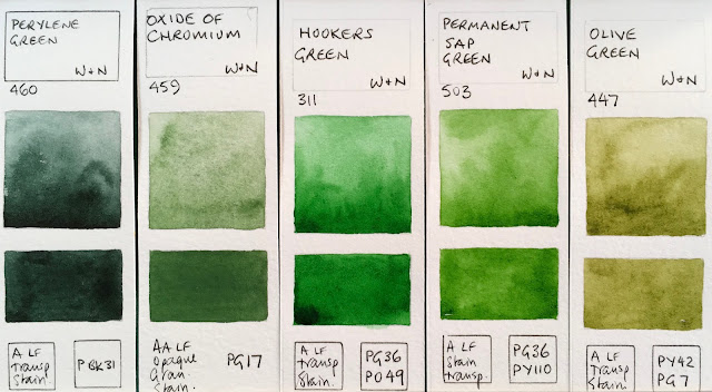
I've been using Daniel Smith watercolours since 1995 - just two years after they were first produced. They started with just 18 colours, including quinacridone gold, sap green, new gamboge, yellow ochre and the raw and burnt siennas that I still love today.

Now the range has expanded to a rather massive 252 colours, including the fascinating Primateks and also the 48 luminescent, pearlescent and interference colours that I won't include here. They are arranged based on the two colour charts I have - the newest and a previous one. Colour reproduction is not bad, but not perfect.

Of course you don't need all these colours and nor have I bought them all. I've bought many of them, collected others as free samples and been sent a few by fellow artists and Daniel Smith the company - including the 8 new colours. But many have been tested only from the wonderful dot cards that Daniel Smith were the first to produce, such as the Mayan Yellow and many of the other Mayan colours.

I can talk about colours for ever, but will just include a few comments here about the colours I particularly like or use or recommend a lot. The choices are vast :-)


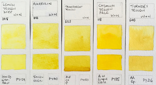
I love Buff Titanium - think of it as an unbleached white. Lovely granulation and perfect for beaches and sandstone, snow gums and marble. There are quite a few great lemon and mid yellows to enjoy.
Daniel Smith Watercolours - Buff Titanium, Nickel Titanate Yellow, Bismuth Vandate Yellow, hansa Yellow Light, Azo Yellow, Quinaphthalone Yellow.

Daniel Smith moved away from cadmiums many years ago but I've included some just for comparison. Cadmium colours are very lightfast and fun to use, but I generally prefer more transparent watercolours for the yellows and reds. I particularly like Hansa Yellow Medium - a lovely mid yellow.
Daniel Smith Watercolours - Cadmium Yellow Light (discontinued 2007-8), Cadmium Yellow Light Hue, Aureolin, Cadmium Yellow Medium Hue, Hansa Yellow Medium, Mayan Yellow.

Indian Yellow has changed formulation but I haven't tried the new version. Nice pigments though.
Daniel Smith Watercolours - Lemon Yellow, Cadmium Yellow Deep (discontinued 2010), Indian Yellow (discontinued), Indian Yellow (I haven't tried the new mix!), Naples Yellow, New Gamboge (discontinued since PY153 is no longer available)

New Gamboge has also changed formula, since PY153 is not longer available. It's a shame as it's a gorgeous warm yellow pigment so grab any you happen to find if you like the original version. Aussie Red Gold is new this year and a lovely bright golden orange yellow. Mixes lovely greens with a range of blues. Hansa Yellow Deep is another excellent single pigment warm yellow option, that works very nicely as a pair with Hansa Yellow Light.
Daniel Smith Watercolours - New Gamboge (I haven't tried the new hue), Hansa Yellow Deep, Isindoline Yellow, Permanent Yellow Deep, Aussie Red Gold (new 2017), Pyrrol Orange.

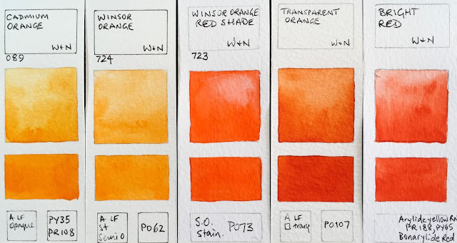
I love orange, but don't tend to have it in my palette since it is easy to mix. I do love transparent Pyrrol orange though - it's what I use personally as a warm red.
Daniel Smith Watercolours - Permanent Orange, Cadmium Orange Hue, Perinone Orange, Cadmium Red Scarlet Hue, Cadmium Scarlet (discontinued 2010), Transparent Pyrrol Orange.

My favourite of all these scarlets is Pyrrol Scarlet - bright and beautiful. Quinacridone Coral really is a coral colour - called quinacridone red by many other brands that use the PR209 pigment.
Daniel Smith Watercolours - Organic Vermilion, Mayan Orange, Quinacridone Coral, Pyrrol Scarlet, Perylene Scarlet, Anthraquinoid Scarlet.

While I don't choose to have a mid rd in my palette, there are plenty to choose from. I like the Pyrrol Red best.
Daniel Smith Watercolours - Cadmium Red (discontinued 2010), Cadmium Red Medium Hue, Pyrrol Red, Perylene Red, Permanent Red, Permanent Red Deep.

Quinacridone Red is very like Quinacridone Rose though slightly richer. I have only tried Mayan Red from a DS dot so this may not be a fair indication of its true character. While I don't use the fugitive Alizarin Crimson, I am glad we can still buy it to see what all the fuss is about. Rhodonite starts more of a rose when freshly painted but becomes more magenta with exposure to oxygen.
Daniel Smith Watercolours - Quinacridone Red, Anthraquinoid Red, Mayan Red, Alizarin Crimson, Permanent Alizarin, Rhodonite Genuine.

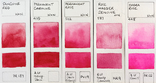
I rather like Carmine as a great 'primary' red, though I tend to use Quinacridone Rose more often. The new Rose Madder Permanent is closer to the original Rose Madder pink, but it won't fade. I know many love Opera Rose, but it will fade.
Daniel Smith Watercolours - Carmine, Rose Madder Genuine (discontinued 2017), Rose Madder Permanent (new 2017), Opera Pink, Potter's Pink, Quinacridone Pink.

Many of the Daniel Smith quinacridone colours are very similar. I particularly love Quinacridone Rose as a gorgeous rose pink but also to mix amazing purples. The new Quinacridone Lilac (called Quin Magenta in many other ranges) is also excellent for this purpose, and as a primary red. Pyrrol Crimson is a palette basic for me.
Daniel Smith Watercolours - Quinacridone Rose, Quinacridone Magenta, Quinacridone Lilac (new 2017), Pyrrol Crimson, Quinacridone Fuchsia, Mayan Violet.

I tend to mix my own purples, but there are some lovely granulating pigments that can add texture to your paintings. PV49, PV14 are never powerful colours, but have interesting granulation.
Daniel Smith Watercolours - Bordeaux, Permanent Violet, Quinacridone Violet, Perylene Violet, Cobalt Violet, Cobalt Violet Deep.

...and nor is PV15. But mixing Ultramarine with PV19 creates fabulous strong and granulating purples.
Daniel Smith Watercolours - Ultramarine Red, Rose of Ultramarine, Imperial Purple, Quinacridone Purple, Purpurite Genuine, Ultramarine Violet.

The photograph doesn't capture the beauty of the Amethyst, which, like many of the Primateks, has a touch of sparkle. It's a powerful but slightly neutralised deep purple. I love the crazy granulation of the three-pigment Moonglow - the rose floats, the viridian speckles and the ultramarine granulates - it is rather fun to play with. Shadow Violet is similar but cooler.
Daniel Smith Watercolours - Amethyst Genuine, Carbazole Violet, Wisteria (new 2017), Cobalt Blue Violet, Moonglow, Shadow Violet.

There are so many gorgeous blue pigments! I love the richness of Indanthrone blue and the granulation of Sodalite. It can be used as a great shadow colour, or for fabulous stormy skies.
Daniel Smith Watercolours - Sugilite Genuine, Kyanite Genuine, Indigo, Mayan Dark Blue, Indanthrone Blue, Sodalite Genuine.

Ultramarine is a palette staple for me, but I also love Cobalt Blue.
Daniel Smith Watercolours - Lavender (new 2017), Lapis Lazuli Genuine, Smalt Genuine, Ultramarine Blue, French Ultramarine, Cobalt Blue.

Phthalo Blue Green and Red Shades behave in a similar manner - you can see there that the Red Shade is definitely warmer. I generally suggest the Green Shade if you want it to be your cool blue.
Daniel Smith Watercolours - Phthalo Blue Red Shade, Verditer Blue, Phthalo Blue Green Shade, Prussian Blue, Mayan Blue Genuine, Cerulean Blue.

Cerulean Chromium is one of my favourites, mixed with ultramarine for skies. Great anywhere in the world :-) It is more powerful and slightly cooler than Cerulean seen above.
Daniel Smith Watercolours - Cerulean Blue Chromium, Azurite Genuine (discontinued 2017), Manganese Blue Hue, Cobalt Teal Blue, Phthalo Turquoise, Ultramarine Turquoise.

Cobalt turquoise is wonderful mixed with a little yellow when you want to create the look of oxidised copper! It's also lovely for seascapes, as are all the cool blues. I love the granulation of Blue Apatite Genuine and Lunar Blue (so many lovely blues!)
Daniel Smith Watercolours - Sleeping Beauty Turquoise, Genuine, Cobalt Turquoise, Amazonite Genuine, Blue Apatite Genuine, Lunar Blue, Fuchsite Genuine.

Phthalo Green Blue Shade is another of my basic colours. I doubt I've ever used it alone, but it's great for mixing. Viridian is very similar in colour but much less powerful and less staining and has lovely granulation.
Daniel Smith Watercolours - Cobalt Green Pale, Natural Kingman Turquoise Genuine, Phthalo Green Blue Shade, Viridian, Malachite Genuine (discontinued 2017) Cascade Green.

Jadeite is a lovely alternative for those who don't want to use the often overpowering phthalo green. As a cool green, it mixes in a similar way, but with granulating and a bit more of a realistic look.
Daniel Smith Watercolours - Diopside Genuine, Jadeite Genuine, Cobalt Green, Spring Green, Permanent Green Light, Phthalo Yellow Green

In 2015, PO49 was replaced in DS mixes with the hue made from PO48+PY150. The new version of Sap Green is shown below. I love Serpentine Genuine - not just because it also comes from Australia, but because it creates a grassy meadow in one wash :-)
Daniel Smith Watercolours - Permanent Green, Phthalo Green yellow shade, Hooker's Green (new formula 2015 not shown), Sap Green (original formula - discontinued 2015), Serpentine Genuine, Chromium Green Oxide.

Green Apatite Genuine is a remarkable paint as it will create soft greens, grassy greens and deep olive greens depending how thickly is it applied - excellent in a limited or plein air palette. Perylene green is fabulous - another of my basic palette colours.
Daniel Smith Watercolours - Green Apatite Genuine, Terre Verte, Sap Green Deep, Perylene Green, Prussian Green, Rage Green Earth

Sap Green, Undersea Green, Perylene Green and, for mixing, Phthalo Green work really well for me, but I love the amazing range of realistic greens available.
Daniel Smith Watercolours - Sap Green (new formula 2015), Undersea Green (new formula 2015), Undersea Green (discontinued formula), Ziosite Genuine, Olive Green, Green Gold.

There are a lot of yellow earth options. I'm not quite sure what the difference is between some of them. I like to use Raw Sienna, Yellow Ochre, Goethite and Mont Amiata Natural Sienna. I quite like Mars Yellow too :-) I haven't explored the new Raw Sienna Light much yet...
Daniel Smith Watercolours - Rich Green Gold, Nickel Azo Yellow, Bronzite Genuine, Verona Gold Ochre, French Ochre, Raw Sienna Light (new 2017)

Daniel Smith Watercolours - Burnt Bronzite Genuine, Burgundy Yellow Ochre, Yellow Ochre, Mars Yellow, Raw Sienna, Quinacridone Gold.

The Quinacridone Gold hue that is used in mix many of the DS colours now is very close to the genuine PO49. I love earthy colours.
Daniel Smith Watercolours - Quinacridone Gold (hue), Transparent Yellow Oxide, Mont Amiata Natural Sienna, Hemetite Burnt Scarlet, Environmentally Friendly Yellow Iron Oxide, Goethite.

Lunar Earth is one of the most incredible granulating colours. Granulation is something Daniel Smith does so well :-)
Daniel Smith Watercolours - Quinacridone Gold Deep (original formula - now PO48+PY150 not shown), Italian Deep Ochre, Lunar Earth, Burnt Yellow Ochre, Garnet Genuine

While I love the earth colours, I tend to have a yellow earth, an orange earth and a red earth at leat in my palette, and I love the most opaque of watercolours Indian Red as a red earth.
Daniel Smith Watercolours - burgundy Red Ochre, Indian Red, Venetian Red, Italian Burnt Sienna, Quinacridone Burnt Orange, Quinacridone Sienna (original mix, now made with PO48+PY150 +PR209)


Daniel Smith Watercolours - Pompeii Red, Red Fuchsite Genuine, Terre Ercolano, Minnesota Pipestone, Italian Venetian Red, English Red Earth.

So many amazing colours...Quinacridone Burnt Scarlet is also known as brown madder.
Daniel Smith Watercolours - Quinacridone Burnt Scarlet, Perylene Maroon, Sedona Genuine, Deep Scarlet. Napthalmide Maroon, Lunar Red Rock.

Piemontite is another favourite 'extra' colour. It is a bit like an Indian Red but has a gorgeous dusty rose undertone. The primateks are so interesting.
Daniel Smith Watercolours - Piemontite Genuine, Tiger's Eye Genuine, Burnt Tiger's Eye Genuine, Hematite Genuine, German Green Raw Umber, Hematite Violet Genuine.
Transparent Red Oxide is one of my absolute favourite watercolours - the perfect colour for rust, which I love to paint. Permanent Brown is also an interesting non-granulating red-brown.
Daniel Smith Watercolours - Mummy Bauxite, Permanent Brown, Raw Umber Violet, Transparent Brown Oxide, Transparent Red Oxide, Environmentally Friendly Red Iron Oxide.

Burnt Sienna as a palette staple and I love this version - PBr7 rather than the common PR101 burnt orange version. Burnt Umber is a lovely classic watercolour - a rich warm brown. I love the granulation of the Enviro-friendly watercolours. The EF Brown Iron Oxide is excellent as a really granulating burnt umber option.
Daniel Smith Watercolours - Fired Gold Ochre, Burnt Sienna Light (new 2017, though limited release as part of the Alvaro set)), English Red Ochre, Burnt Umber, Environmentally Friendly Brown Iron Oxide.
Raw Umber is a colour I use a lot as a cool dark brown, and I usually include it in a palette of 12 or more as it is not an easy cool dark brown to mix on the fly.
Daniel Smith Watercolours - Raw Umber, Sepia, Sickerite Genuine, Van Dyck Brown, Bloodstone Genuine, Lunar Violet.

And now for some darks. I don't tend to use black in watercolours but the Graphite Gray is like working with liquid pencil - lovely!
Daniel Smith Watercolours - Neutral Tint, Payne's Blue Gray (new 2017), Graphite Grey, Payne's Grey, Lamp Black. Black Tourmaline Genuine.
I thought Yavapai Genuine might have been discontinued as it was missing from the previous colour chart but it's on the new one and here it is - out of order!. Lunar Black makes me break all my not-using-black rules, (it's an extra colour I have fun with), just as Buff titanium puts a white pigment in my palette :-) Titanium white is whiter and more opaque than Chinese White I think.
Daniel Smith Watercolours - Yavapai Genuine, Ivory Black, Lunar Black (sorry - miss-spelt), Chinese White, Titanium White.
I'll finish with a few that have been discontinued some time ago but I'll show them anyway as it's rather nice to know what they looked like...
Daniel Smith Watercolours - Cote d'Azur Violet (discontinued), Bohemian Green Earth (Discontinued), Vivianite Blue Ochre (discontinued), Hot Mulled Cider (limited seasonal release)
As always, if you notice any errors, do let me know.
Happy painting :-)

Winsor & Newton Watercolours - (almost) full range

$
0
0
My first watercolours over 35 years ago was a small sketching kit - Cotman student colours I suppose - that I still had until my car was broken into and it was taken about 10 years ago. I'd changed the colours over to professional colours by then but I rather liked that palette and it had been all over the world with me..

I don't use many Winsor & Newton watercolours are they are very expensive outside of the UK, and some of my favourite colours are mixed pigment or different hues so they just don't suit what I am after. For example burnt sienna is PR101 rather than my preferred PBr7; raw sienna is a mix of Py42 + PR101 rather than PBr7, Quinacridone Gold is a rather unnecessary and ugly mix of three pigments PY150+PR206+PV19 (when they could have simply used PY150 + PR101) and raw umber is not deep and dark enough. I also find that the tube colours don't rewet terribly well without adding some glycerine since they are, I understand, designed to be used fresh from the tube.

However, they are a very well-known brand, usually available throughout the world, and they have some great colours so here is the (almost) full range - I'm missing 5....

The swatches have been photographed and colour matches are ok but not perfect. I'll note in my comments where they are way out.

PY53 is not a powerful pigment. I've never found a use for it, and there are much prettier cool or lemon yellows available.

Winsor & Newton Watercolours - Lemon Yellow, Bismuth Yellow, Cadmium Lemon, Winsor Lemon, Winsor Yellow.

I rather like the Transparent Yellow of this row. Turner's Yellow has more of a slight yellow ochre pastel look to it than it appears here. Picture the look of a cad deep mixed with a little white.
Winsor & Newton Watercolours - Lemon Yellow Deep, Aureolin, Transparent Yellow, Cadmium Yellow Pale, Turner's Yellow.

These yellow are all much more orange-yellow than they appear - I just can't adjust to make them look right. Winsor Yellow Deep is made with an excellent warm yellow pigment.
Winsor & Newton Watercolours - New Gamboge (now made with PY150 + PR209), Cadmium Yellow, Winsor Yellow Deep, Indian Yellow, Cadmium Yellow Deep.

Cadmium Orange and Winsor Orange are more orange then they look here and Winsor Orange Red Shade is more or a warm red. Transparent Orange is one of the three most beautiful single pigment oranges - along with Schmincke Transparent orange and Da Vinci Benzimida Orange Deep.
Winsor & Newton Watercolours - Cadmium Orange, Winsor Ornage, Winsor Orange Red Shade, Transparent Orange (Limited Edition Colour), Bright Red (discontinued).

 Scarlet Lake is probably the best warm red option.
Winsor & Newton Watercolours - Cadmium Scarlet (not shown), Scarlet Lake, Cadmium Red, Cadmium Red Deep, Winsor Red.
 I like Winsor Red Deep for a good strong crimson. these swatches are closer to reality. I never use Alizarin Crimson but I do think it is helpful that is is still manufactured, as long as it is clearly marked as fugitive.
Winsor & Newton Watercolours - Rose Dore, Quinacridone Red, Winsor Red Deep, Permanent Alizarin Crimson, Alizarin Crimson.
 Permanent Rose is great as a mixing rose or even as a primary red. W&N are the only manufacturer to still make genuine Rose Madder, and I'm glad it is still available to see what it looks like though it is also fugitive.
Winsor & Newton Watercolours - Sanguine Red (discontinued), Permanent Carmine, Permanent Rose, Rose Madder Genuine, Opera Rose.

 Quinacridone Magenta is a perfect choice for a CYM palette.
Winsor & Newton Watercolours - Quinacridone Magenta, Permanent Magenta, Cobalt Violet, Permanent Mauve, Quinacridone Violet.

I like the granulation of PV15 Ultramarine, though it is not a strong mixer. I was really surprised to see this pigment in the rather amazing Smalt Blue limited edition colour.
Winsor & Newton Watercolours - Ultramarine Violet, Winsor Violet (Dioxazine), Smalt Blue (limited edition), Indanthrene blue, cobalt Blue Deep.

Winsor & Newton Watercolours - French Ultramarine, Ultramarine (Green Shade), Cobalt blue, Phthalo Sapphire, Winsor Blue Red Shade.


Winsor & Newton Watercolours - Antwerp blue, Prussian blue, Winsor Blue (Green Shade), Cerulean Blue Red Shade, Cerulean Blue.

Cobalt colours are expensive, but add so much lovely texture.
Winsor & Newton Watercolours - Manganese Blue Hue, Phthalo Turquoise, Cobalt Turquoise Light, Cobalt Turquoise, Cobalt Green.

Winsor Green and Winsor Green Blue Shade are the same thing if they are made with PG7.
Winsor Green (Blue Shade), Winsor Green, Viridian, Winsor Green (Yellow Shade), Terre Verte.

I love Perylene Green for the shadows in foliage and am rather fascinated by the granulation and opacity of PG17 though I've never really explore this pigment.
Perylene Green, Oxide or Chromium, Hooker's Green, Permanent Sap Green, Olive Green.

Green gold is useful for the look of sunlight shining through foliage...
Winsor & Newton Watercolours - Terre Verte (Yellow Shade) not shown, Green Gold, Naples Yellow, Naples Yellow Deep, Yellow Ochre Light (not shown).
The Raw Sienna mix is one of the reasons I don't use W&N earth colours, though I do like the yellow ochre.
Winsor & Newton Watercolours - Yellow Ochre, Raw Sienna, Yellow Titanate, Gold Ochre, Quinacridone Gold (genuine - discontinued)

Magnesium Brown is rather fun. Schmincke has just released a colour using this pigment too.
Winsor & Newton Watercolours - Quinacridone Gold, Gold Brown (limited edition), Brown Ochre, Magnesium Brown, Burnt Sienna.

W&N Indian red is a fairly well behaved version of this colour. It can be rather wild and a little crazy, which is fun. Indian Red Deep is an interesting red-brown pigment made by a few other manufacturers. Brown Madder is Quinacridone Burnt Scarlet in DS.
Winsor & Newton Watercolours - Light Red, Venetian Red, Indian Red (limited edition), Brown Madder.

Raw Umber is another of the W&N colours that I just don't like - I much prefer the deep dark cool brown versions of Daniel Smith or Da Vinci and others.
Winsor & Newton Watercolours - Potter's Pink, Perylene Maroon, Perylene Violet, Caput Mortuum Violet (not shown), Raw Umber.


Winsor & Newton Watercolours - Burnt Umber, Vandyke Brown, Dark Brown (special limited edition), Sepia, Indigo.

I'd be curious to know if the W&N Mars Black is as granulating is the DS one. Also just released this year by Schmincke.
Winsor & Newton Watercolours - Payne's Grey, Neutral tint, Ivory Black, Lamp Black, Mars Black (not shown)
I don't tend to use black or white watercolours but they are important, as are some greys for convenience.
Winsor & Newton Watercolours - Charcoal Grey, Davy's Grey, Chinese White, Titanium White.

As always, please let me know if I have made any errors.
Happy painting :-)

See also - 
Daniel Smith new colours 2017 here
Daniel Smith full range here
Schmincke new colours 2017 here 
Schmincke full range here
Blockx full range here
MaimeriBlu full range here
Mijello Mission Gold full range here

I'm working on Da Vinci and Old Holland next...


YInMn Blue

$
0
0


I was so excited when I heard that a new pigment had been discovered. Like many, by accident, back in 2009, in Oregon State University. The Professor's name is Mas Subramanian.

The name of the pigment comes from the chemicals that form this colour - Yttrium, Indium and Manganese.

Manganese oxide is normally black, Yttrium and Indium are yellow and white, so creating a blue when they were heated was a total surprise! It is a stable and non-toxic inorganic pigment, that reflects heat and absorbs ultraviolet so may be used for insulation.

The colour is described as being between ultramarine and cobalt blue. It is also compared with cobalt deep blue. I think of it as rather like a granulating Indanthrone blue - like a mix of PB60 and PB74. Very beautiful.

I've been curiously watching for it to be made into a paint. I saw an acrylic limited edition made by Matisse, and an oil version made by Gamblin but these were described as very opaque paints. Here it is in watercolour. The granulation really makes it something special.

I've tried to adjust to get the colour accurate but it is just a little more dull or greyed than it looks on my screen.

The pigment costs about 6 times more than cobalt or cerulean pigments due to the cost of the rare earth element Indium. It is not necessarily likely to be made as a watercolour any time soon, but it is not impossible if there is enough interest.

This was a Daniel Smith R&D sample and it was thought that as it it is expensive, it may not offer enough to be developed further. What do you think? Whould you buy it?


Da Vinci Watercolours (almost) complete range

$
0
0
Da Vinci (USA) is a third generation family owned company based in California. They make oils, acrylics, gouache, painting mediums and, of course, watercolour. What's great is that they make watercolours in a huge range of tube sizes from 5ml to 15ml to 37ml, as well as a couple of palettes of selected pan colours. You can see the full watercolour chart here.

I have been using their 37ml tubes for many years to make up my students' palettes. Don't get me wrong - they are not student colours. My student palettes are made up entirely of artist quality colours, but I use a mix of Daniel Smith and Da Vinci to make them up. The 37ml DV tubes are so economical that I can price my palettes at a very reasonable rate and get my students started with artist quality watercolours. They are probably some of the most consistent watercolours available - thick and strong out of the tube, and they rewet well. They are now available in Sydney, Australia from Pigment Lab in Newtown, who will also do mail order.

I haven't tried their full range of over 100 colours, but I have tried many and rather than wait until I test the last few, I'll post all I have here for comparison. These swatches are all gradually being added to my website here.

As always, I've tried to colour match, but will mention it when the colour I see on my screen and the colour of the swatches is way out...

First are the cool yellows. Hansa Yellow Light is the coolest of these and a very clean yellow. I don't recommend PY40 as it will fade in washes and can discolour in mass-tone.
Da Vinci Watercolours - Nickel titanate yellow (not shown, but not usually a very strong pigment), Cadmium Yellow Lemon, Hansa Yellow Light, Da Vinci Yellow, Aureolin Mixture.

for some reason, I really struggle to show the true beauty of the orange-yellows - Gamboge Hue is definitely more orange than this swatch - it looks more like the Hansa Deep shown next.
Da Vinci Watercolours - Arylide Yellow, Cadmium Yellow Light, Hansa Yellow Medium, Cadmium Yellow Medium, Gamboge Hue.
 ...and these are all more on the orange side then they appear here. The Arylide Yellow Deep is the same pigment (and the same colour) as DS hansa yellow deep and Schmincke Chromium yellow hue deep.
Da Vinci Watercolours - Hansa Yellow Deep, Cadmium Yellow Deep, Arylide Yellow Deep, Indian Yellow, Benzimida Orange.
These swatches should also be a little more on the red side. The DaVinci Cadmium orange is a lovely single pigment version - in many ranges this colour is a mix.   Benzimida Orange Deep is one of my favourite single pigment oranges - along with Schmincke's Transparent Orange. It's rich and powerful.
Da Vinci Watercolours - Cadmium Orange, Da Vinci Orange, Benzimida Orange Deep, Vermilion Hue, Bright Red.
These should be a little more red. Da Vinci Red is a rich fire engine red, just starting to move past the mid-red and into the blue-red range.
Da Vinci Watercolours - Cadmium Scarlet (not shown), Cadmium Red Light, Permanent Red, Cadmium Red Deep, Da Vinci Red.
 Naphthol Red is described as 'mid tone' and it really does seem a perfect mid red. The tube I have of this was more runny than any others and took a long time to dry. Quinacridone Red is a coral colour - like the DS Quin Coral. The Alizarin Gold is more dull than it looks here, and the Alizarin Crimson (Quin) is more crimson - I think it's the closest I've seen to the genuine but fugitive Alizarin Crimson PR83 pigment.
Da Vinci Watercolours - rose Dore (Quinacridone) not shown, Naphthol Red, Quinacridone Red, Alizarin Gold, Alizarin Crimson (Quinacridone).
 Lots of variations using PV19 here - the Carmine is a little more dull than the Alizarin Quin shown above. The Rose Red Deep and Permanent Rose are so similar that you certainly wouldn't need both.
Da Vinci Watercolours - Carmine (Quinacridone), Perylene Maroon (not shown), Rose Red Deep (Quinacridone), Permanent Rose(quinacridone), Rose Madder (Quinacridone)
 I'm not a fan of Opus Pink and other flouro colours but they are popular. Cobalt Violet is always a very gentle granulating pigment.
Da Vinci Watercolours - Opus (Vivid Pink), Quinacridone Fuchsia, Thioindigo Violet, Cobalt Violet.
 I'm obviously missing a couple of purples - it's not a colour I buy much as I like to mix them. I'd like to rest the Manganese Violet as PV16 is such a lovely granulating red-violet usually. The Mauve is a convenient way to buy the common Ultramarine + Quin Violet or Quin Rose mix if you are painting a lot of purple items. The Ultramarine Violet is a fairly strong version of this gentle granulating pigment.
Da Vinci Watercolours - Cobalt Violet Deep, Lilac Permanent, Manganese Violet, mauve, Ultramarine Violet.
 Da Vinci Violet (also called Winsor Violet, Carbazole Violet, Dioxazine Violet etc) is a powerful and staining pigment. I love Indanthrone Blue. Cobalt Blue Deep is often made from PB74 so it is interesting to see it here made from PB28. It looks very similar to French Ultramarine, but not identical.
Da Vinci Watercolours - Da Vinci Violet, Lavender Permanent, Indanthrone Blue, Cobalt Blue Deep, Cobalt Blue.
 Some more gaps, and it's hard to see the difference between the rd and green shades of phthalo blue, but they are quite different. I find the Green Shade (just called phthalo blue) more useful if you want it as a cool blue, but I like the Red Shade in a CYM palette as the greens are a little less unrealistic.
Da Vinci Watercolours - Phthalo Blue (Red Shade), Lapis Lazuli Genuine (not shown), Prussian Blue, Prussian Blue Green Shade,(not shown), Phthalo Blue.
 You can see that there is a difference between the Ultramarine and the French Ultramarine with  the French being warmer (more red). I prefer the regular. I always prefer genuine cerulean made with PB36 rather than a hue as I love the granulating character of PB36 or PB35.
Da Vinci Watercolours - French Ultramarine, Ultramarine Blue, Ultramarine Blue (Green Shade) (not shown), Cerulean Blue Genuine, Cerulean Blue (Hue)
 It is becoming more difficult to find genuine Manganese blue PB33, with Old Holland perhaps no longer making it. The Da Vinci version also has PB15, but will granulate due to the PB33. Phthalo Turquoise is another lovely option instead of phthalo blue GS. I love Cobalt Turquoise Deep for copper effects and seascapes.
Da Vinci Watercolours - Manganese Blue (Permanent), Phthalo Turquoise, Cobalt Turquoise, Cobalt Turquoise Deep, Cobalt Green Hue (not shown).
 Phthalo Green for mixing and Perylene for deep shadow greens are tow of my favourite palette greens. Viridian is a good choice if you want a less staining cool green option.
Da Vinci Watercolours - Phthalo Green, Viridian Green, Phthalo Green (Yellow Shade), Hooker's Green, Perylene Green.

Chromium Oxide Green is one of the most opaque pigments in watercolour, and it's a pigment I haven't explored much. The others here are convenience mixes, which can be useful if you find you tend to mix these hues a lot yourself.
Emerald Permanent (not shown), Chromium Oxide Green, Hooker's Green Light, Sap Green, Olive Green.
 I love PY129 - it's a great colour for mixing and for the look of sunlight through trees. Nickel Azo Yellow is an interesting cool to mid dull yellow option. I don't tend to work with Naples Yellow but I like this one as it does'n have white pigments in it.
Da Vinci Watercolours - Green Gold, Leaf Green, Nickel Azo Yellow, Naples Yellow, Naples Yellow Deep.
 Some lovely yellow earth options. I'd tend towards the single pigment colours every time.
Da Vinci Watercolours - Yellow Ochre, Raw Sienna, Gold Ochre, Quinacridone Gold, Raw Sienna Deep.
 I love the orange earth colours. DV Burnt sienna is a little more on the orange side than the DS one I use. Lovely granulation.
Da Vinci Watercolours - Raw Umber Natural (not shown), Quinacridone Burnt Orange, Burnt Sienna, Burnt Sienna Deep, Terra Cotta (Light Red).
 PR101 has so many different personalities - here are a few more versions.
Da Vinci Watercolours - Venetian Red, Indian Red Deep, Indian Red, Brown Madder (Quinacridone), Violet Iron Oxide (not shown)
 Burnt Umber and Raw Umber are colours I like to include in most palettes as it gives a deep warm and cool brown. I am not fond of black pigments in watercolour so I like the Indigo made with PB27+PV19 rather than the usual phthalo blue, indanthrone blue or ultramarine mixed with black.
Da Vinci Watercolours - Burnt Umber, Raw Umber, Sepia, Indigo, Payne's Gray.
 I draw a black line on white swatches so I can see how opaque they are, but haven't actually tried these two whites.
Da Vinci Watercolours - Ivory Black, Lamp Black, Davy's Gray, Chinese White (not shown), Titanium White (not shown).
As always, let me know if you notice any mistakes. I'll add the other as I get hold of them.

See the full range of Daniel Smith Watercolours here
Winsor & Newton watercolours here
Schmincke Watercolours full range here
Blockx full range here
Mission gold full range here
MaimeriBlu full range here

I'm working on Old Holland next...


Old Holland Watercolour (almost) complete range

$
0
0
Old Holland goes back to 1664. Their website is really interesting to read :-)

Their current range of 168 watercolours includes 5 whites that I haven't tested -  Highlighting Titanium White (PW6), Tinting Zinc White (PW4), Transparent Chinese White (PW4), Opaque White and Mixed White (PW6).

The rest of the range is shown below apart from a few missing mixed greens. The full colour chart can be seen here and I have arranged these swatches in the same rather unusual order.

Old Holland are very expensive in Australia so I haven't used many of the colours to paint with. I know that Golden Barok Red is a favourite of many, and the Ultramarine Deep and Cerulean Deep are some of the richest available. There are some gorgeous earth colours but also some multi pigment mixes. 

In some cases the website and the printed colour charts have noted different pigments so I have done my best to guess the best options.

The word 'lake' indicates a transparent glazing colour. 'Extra' means it is a traditional colour made from a lightfast pigment.


I always try to show each paint at it's best, but most of these are painted out from tiny dots of colour, sometimes not enough to build a strong wash. All the same, these would seem to be very light colours made largely with white.
Old Holland Watercolours - Old Holland Yellow Light, Old Holland Yellow Deep, Old Holland Yellow Medium, Brilliant Yellow Light, Brilliant Yellow.

 These first two are also tinted white hues painted from tiny dots.
Old Holland Watercolours - Brilliant Yellow Reddish, Naples Yellow Reddish Extra, Flesh Tint, Indian Yellow Green Lake Extra, Cobalt (Aureolin) Lake Extra.

 Scheveningen Yellow Light is a lovely rich primary yellow. The PY3 Scheveningen Yellow Lemon would be a nice cool option.
Old Holland Watercolours - Nickel titanium Yellow, Cadmium Yellow Lemon, Scheveningen Yellow Lemon, Cadmium Yellow Light, Scheveningen Yellow Light.

 These are not quite true to real colour - the three on the right are slightly redder.
Old Holland Watercolours - Scheveningen Yellow Medium, Vermilion Extra, Scheveningen Red Scarlet, Cadmium Red Scarlet, Coral Orange.

 Oranges are always difficult to capture. These swatches are all a little more red than they appear here.
Old Holland Watercolours - Cadmium Orange, Scheveningen Orange, Cadmium Yellow Orange, Cadmium Yellow Extra Deep, Golden Barok Red.

 These are reasonable accurate in colour.
Old Holland Watercolours - Old Holland Red Gold Lake, Indian Yellow Brown Lake Extra, Indian Yellow Ornage LAke Extra, Gamboge Extra Lake, Cadmium Yellow Deep.


Old Holland Watercolours - Scheveningen Yellow Deep, Cadmium Yellow Medium, Old Holland Bright Red, Cadmium Red Light, Cadmium Red Medium.


Old Holland Watercolours - Scarlet Lake Extra, Cadmium Red Deep, Scheveningen Purple Brown, Cadmium Red Purple, Carmine Lake Extra.


Old Holland Watercolours - Alizarin Crimson Lake Extra, Madder (Crimson) Lake Deep Extra, Burgundy Wine Red, Scheveningen Red Deep, Madder (Geranium) Lake Light Extra.


Old Holland Watercolours - Scheveningen Red Light, Scheveningen Red Medium, Rose Dore Madder Lake Antique Extra, Old Holland Violet Grey (may also have PG18 in the mix), Old Holland Blue Violet.


Old Holland Watercolours - Dioxazine Violet, Ultramarine Violet, cobalt Violet Dark, Manganese Violet Blueness, Old Holland Bright Violet.


Old Holland Watercolours - Cobalt Violet Light, Manganese Violet Reddish, Scheveningen Violet, Ultramarine Red Pink, Royal Purple Lake.


Old Holland Watercolours - Old Holland Magenta, same colour as left, Magenta (Quinacridone), painted from a more generous sample), Scheveningen Rose Deep, ruby Lake, Brilliant Pink.


Old Holland Watercolours - Neutral Tint, Payne's Grey, Old Holland Blue Deep, Parisian (Prussian) Blue Extra.


Old Holland Watercolours - Old Holland Blue, Scheveningen Blue Deep, Blue Lake, Indigo Extra, Scheveningen Blue.

There are a number of beautiful cool blues - the Caribbean Blue and Cerulean Blue Deep in particular.
Old Holland Watercolours - Caribbean Blue, Cobalt Blue Turquoise, Cerulean Blue Deep, Cerulean Blue, Cerulean Blue Light.


Old Holland Watercolours - Manganese Blue Deep, Viridian Green Deep, Cobalt Green Deep, Cobalt Green Turquoise, Turquoise Blue Deep.


Old Holland Watercolours - Cobalt Blue Turquoise Light, Old Holland blue Grey, Scheveningen Blue Light, King's Blue Light, King's Blue Deep.


Old Holland Watercolours - Cobalt Blue, Old Holland Cyan Blue, Cobalt Blue Deep, French Ultramarine Light Extra, Ultramarine Blue.

The Old Holland Ultramarine Blue Deep is probably the most rich and granulating available. Manganese blue genuine may be difficult to find now as this pigment has been discontinued. Scheveningen Green Deep is of course 'phthalo green'.
Old Holland Watercolours - Ultramarine Blue Deep, Manganese Blue, Viridian Green Light, Cobalt Green, Scheveningen Green Deep.


Old Holland Watercolours - Scheveningen Green, Permanent Green Deep, emerald Green, Permanent Green Light (not shown), Old Holland Bright Green (not shown).

There area number of mixed greens that I haven't tried. They are all mixed pigment greens.
Old Holland Watercolours - Cadmium Green Deep (not shown), Cadmium Green Light, Cinnabar Green Light Extra (not shown), Old Holland Yellow Green (not shown), Old Holland Green Light (not shown)


Old Holland Watercolours - Permanent Green (not shown), Sap Green Lake Extra, Old Holland Golden Green, Raw Sienna Light, Italian Earth.

These are all very similar, it's not just the photo, but I rather like the PBr24 Naples Yellow Deep Extra. It's much nicer than most mixed Naples Yellow versions.
Old Holland Watercolours - Gold Ochre, Yellow Ochre Deep, Yellow Ochre Light, Mars Yellow, Naples Yellow Deep Extra.


Old Holland Watercolours - Naples Yellow Extra, Green Umber, Green Earth, Olive Green Dark, Hooker's Green Light Lake Extra.


Old Holland Watercolours - Hooker's Green Lake Deep Extra, Cinnabar Green Deep Extra, Chromium Oxide Green, Old Holland Golden Green Deep, Raw Sienna Deep.


Old Holland Watercolours - Brown Ochre Light, Old Holland Yellow Brown, Transparent Oxide Yellow Lake, Italian Brown Pink Lake, Transparent Oxide Red Lake.


Old Holland Watercolours - Mars Orange Red, Yellow Ochre Half Burnt, Yellow Ochre Burnt, Old Holland Light Red, Burnt Sienna.


Old Holland Watercolours - Red Ochre, English Red, Flesh Ochre, Venetian Red, Persian (Indian) Red.


Old Holland Watercolours - Old Holland Cold Grey, Scheveningen Warm Grey, Old Holland Warm Grey Light, Davy's Grey, Van Dyck Brown (Cassel) Extra.


Old Holland Watercolours - Sepia Extra, Old Holland Ochre, Raw Umber, Raw Umber - same paint, different batch, Burnt Umber.


Old Holland Watercolours - Deep Ochre, Warm Sepia Extra, Brown Ochre Deep, Red Umber, Mars Brown.


Old Holland Watercolours - Caput Mortuum Violet, Vine Black, Ivory Black Extra (PBk9), Scheveningen Intense Black (PBk7), Mars Black.

You can find the full range of many other brands on this blog. I am working on Sennelier next...

Rembrandt Watercolours

$
0
0
Rembrandt watercolours are the professional range made by Royal Talens of Holland. I had only tried about 15 of the 80 colours shown on the colour chart until I was generously lent a brand new set of 48 by one of my students. Consequently most of these are painted out from pan colours.

I love the Rembrandt soft pastels, which I have used for many years, so it was good to paint a large number of the professional watercolours at once. The student range is Van Gogh.

They painted out nicely and I think it's a very no-fuss range. Great colours, a good choice of pigments, excellent earth colours and plenty of single pigment colours. Though I am missing about 30 from this range, I have decided to post them up anyway since there is not much available showing the Rembrandt colours.

Rembrandt set of 48 half pans.

Rembrandt Watercolour - Chinese White, Transparent titanium White (not shown), Cadmium Yellow Lemon, Permanent Lemon Yellow (not shown), Cadmium Yellow Light.

Rembrandt Watercolour - Azo Yellow Light (not shown), Cadmium Yellow Medium (not shown), Azo Yellow Medium, Cadmium Yellow Deep, Azo Yellow Deep (not shown)

Rembrandt Watercolour - Aureoline, Indian Yellow (not shown), Gamboge, Naples Yellow Deep (not shown), Naples Yellow Red (not shown).

Rembrandt Watercolour - Cadmium Orange, Permanent Orange (not shown), Vermilion, Cadmium Red Light, Permanent Red Light (not shown).

Rembrandt Watercolour - Cadmium Red Medium, Permanent Red Medium (not shown), Cadmium Red Deep, Permanent Red Deep (not shown), Permanent Red Light (not shown).

Rembrandt Watercolour - Madder Lake Deep (not shown, but PR83 so not recommended), Alizarin Crimson (not shown but also PR83 so not recommended), Permanent Madder Lake, Carmine, Quinacridone Rose.

Rembrandt Watercolour - Permanent Red Violet, Permanent Madder Purple (not shown), Cobalt Violet, Mauve, Permanent Blue Violet.

Rembrandt Watercolour - Ultramarine Violet (not shown), French Ultramarine, Ultramarine Deep, Cobalt Blue (Ultramarine) (not shown), Cobalt blue.

Rembrandt Watercolour - Cerulean Blue, Cerulean Blue (Phthalo) (not shown), Phthalo Blue Red, Phthalo Blue Green, Prussian Blue.

Rembrandt Watercolour - Indanthrene Blue, Indigo (not shown), Turquoise Blue, Bluish Green (not shown), Permanent Yellow Green (not shown).

Rembrandt Watercolour - Permanent Green, Emerald Green, Cobalt Green (not shown), Viridian, Phthalo Green.

Rembrandt Watercolour - Hooker Green Deep, Hooker Green Light (not shown), Sap Green, Olive Green (not shown), Green Earth (not shown).

Rembrandt Watercolour - Chromium Oxide Green, Yellow Ochre, Gold Ochre (not shown), Transparent Oxide Yellow, Raw Sienna.

Rembrandt Watercolour - Burnt Sienna, Transparent Red Oxide, Permanent Madder Brown, Light Oxide Red, Venetian Red.

Rembrandt Watercolour - Indian Red, Burnt Umber, Raw Umber, Transparent Oxide Brown, Sepia.

Rembrandt Watercolour - Vandyck Brown, Payne's Grey, Neutral Tine, Ivory Black, Lamp Black (not shown).


I am working on Lukas and Sennelier next. If you happen to have some of the missing Rembrandt colours and would like to send me a sample, please get in touch :-)

Sketching and Sketchbook Exhibition

$
0
0
I have been busy preparing for two exhibitions - the first opened on Tuesday night, and the other, the AWI annual exhibition, opens on the 10th June at Juniper Hall - more about that soon.

Chantal and Rooi hanging about :-)
The Sketching and Sketchbook Exhibition features a number of Urban Sketching artists with sketchbooks and framed sketches on display. It's a fabulous chance to peek into the precious sketchbooks of about 40 artists of various levels of experience and to buy framed sketches or larger works inspired by sketches.

It is at the Creative Space, 105 Abbot Road Dee Why. It is on until the 11th June.

I'll be doing an artist talk on the 6th June 2-4 about using sketchbooks in the process of creating published books.


Chris's canvas paintings made a great statement
Three of my paintings - Bo


Opening night.

I've exhibited a painting based on a sketch I did in Jindabyne  - the sketch is in a small Moleskine watercolour sketchbook A5. The painting is a half sheet watercolour, called 'Snow Gum'.


I have also exhibited two versions of paintings created from a sketch I did at the Shaolhaven River. 

On the right is Boyd's Rock Quartet, Shoalhaven River

(The software is playing up and I can't edit this post properly or add captions to the rest so sorry about the random layout!)

Below is the sketch on location - the water really was a remarkable gold as it reached the bank I was sitting on.


On the right is Boyd's Rock Quartet III, intended to really zoom in on the lovely group of rocks that Arthur Boyd painted over and over again. This is a full sheet of Arches watercolour paper.

I've also put in two studies from life - Shells and Jacaranda Pods, and a study of a Venetian Door. 


For more information click here
Council website here
Facebook page here.


Sennelier Watercolours

$
0
0
The French brand Sennelier, which has been around since 1887, make a huge range of wonderful art materials - inks, pastels, all sorts of paints, dry pigments and so on. I've used their oil pastels for years but I've actually never bought any of their watercolours, so this post is created entirely with the help of others :-)

The watercolour range of 98 colours was reformulated a few years ago with a higher honey content. Quoted from the Sennelier website -

"Honey has many virtues: a symbol of light and sun, an emblem of poetry and science and has been used since Ancient times as a remedy for dry skin and to help heal wounds. This nectar is used in L'Aquarelle Sennelier not only as a preservative but as an additive giving incomparable brilliance and smoothness to the paint. Always striving for excellence, Sennelier has reworked its watercolor formula with increasing the amount of Honey in the paint to reinforce the longevity of the colors, their radiance and luminosity."

Unfortunately, honey also makes watercolours stay more runny, so this has made it far more challenging to get hold of samples as they don't necessarily dry enough to be posted through the mail - lots of inventive solutions including using blister packs from chewing gum, contact lenses and tablets have needed to be devised.

48 half pan set of
Sennelier L'Aquarelle Watercolours
However they are also available in 1/2 and full pan form, and one of my students lent me her 48 colour pan set so I was able to fill a number of gaps. Here are all but 18 of the Sennelier professional or L'Aquarelle range. There is also a student range called La Petite.

The set uses the same palette as Rembrandt, but includes this useful overlay showing what each colour is.

The full colour chart can be seen here.

For those who use watercolours straight from the tube, Sennelier (and M.Graham) tube colours are a possible choice. For those who, like me, use them dried out in palettes, the pan versions are the best options with this range. They rewet beautifully.

Here is the 48 colour set open.


 As always, I have tried to colour-match as well as possible but this is just a guide to the actual colours.

Sennelier L'Aquarelle professional Watercolours - Titanium White, Chinese White (not shown), Nickel Yellow (not shown), Lemon Yellow, Aureoline (not shown but not a recommended pigment).
 The Indian Yellow is warmer than it looks here.
Sennelier L'Aquarelle professional Watercolours -  Cadmium Lemon Yellow (not shown), Primary Yellow, Cadmium Yellow Light, Sennelier Yellow Light, Indian Yellow.

Sennelier L'Aquarelle professional Watercolours - Yellow Lake, Naples Yellow, Yellow Sophie, Naples Yellow Deep, Cadmium Yellow Deep  (not shown).
These colours are all richer and warmer than they appear here. It is always very difficult to show warm yellows and oranges accurately. Sennelier Yellow Deep is a lovely warm yellow option.
Sennelier L'Aquarelle professional Watercolours - Sennelier Yellow Deep, Cadmium Yellow Orange (not shown), Red Orange, Sennelier Orange, Chinese Orange.


 There are some gorgeous bright warm reds in this range!
Sennelier L'Aquarelle professional Watercolours - French Vermilion, Scarlet Laquer, Rose Dore Madder Lake, Bright Red, Cadmium Red Light.

 Rose Madder Lake is the colour usually referred to as Quinacridone Rose or Permanent Rose - a great cool red option. Thought Carmine is the same pigment and also very pretty.
Sennelier L'Aquarelle professional Watercolours - Alizarin Crimson (this is a permanent hue), Carmine, Crimson Lake (not shown), Quinacridone Red, Rose Madder Lake.

Sennelier L'Aquarelle professional Watercolours - Opera Rose, Cobalt Violet Light Hue, Permanent Magenta, Cobalt Violet Deep Hue, Red Violet.

Sennelier L'Aquarelle professional Watercolours - Sennelier Red, Perylen Brown (not shown), Cadmium Red Purple (not shown), Alizarin Crimson Lake (not recommended due to poor lightfast rating of this pigment), Venetian Red.

Sennelier L'Aquarelle professional Watercolours - Helios Purple, Blue Violet, Dioxazine Purple, Prussian Blue, Indigo.
The French Ultramarine Blue is a two pigment mix so go with the Ultramarine Deep if you want a single pigment Ultramarine.
Sennelier L'Aquarelle professional Watercolours - Blue Indanthrone, Cobalt Deep, Cobalt Blue, Ultramarine Deep, French Ultramarine Blue.

'Blue Sennelier' is often referred to as Phthalo Blue Red Shade.
Sennelier L'Aquarelle professional Watercolours - Ultramarine Light, Blue Sennelier,  Phthalo Blue, Cinereous Blue, Royal Blue (not shown).

 It's unusual to see a Cerulean made with PB28 rather than PB35 or PB36.
Sennelier L'Aquarelle professional Watercolours - Cerulean Blue, Cerulean Blue Red Shade (not shown), Turquoise Green, Cobalt Green, Phthalo Turquoise.

 There isn't a single pigment Phthalo Green PG7, but the mixed pigment Viridian is a rather nice option.
Sennelier L'Aquarelle professional Watercolours - Forest Green, Phthalo Green Deep, Viridian, Emerald Green, Sennelier Green.
 The Olive green is a lovely premixed green. I don't know where the 'Brown Pink' gets it name...
Sennelier L'Aquarelle professional Watercolours - Olive Green, Phthalo Green LIght, Bright Yellow Green, Brown Green, Brown Pink.
The Sap Green is also a very usable foliage green mix. I love the granulation of the opaque Chromium Oxide Green - a colour I've never used but always rather like...
Sennelier L'Aquarelle professional Watercolours - Cadmium Green Light (not shown), Hooker's Green, Chromium Oxide Green, Green Earth (not shown), Sap Green.
 I'm always happy to see a PBr7 Burnt Sienna. Caput Mortuum is like a deep Indian Red.
Sennelier L'Aquarelle professional Watercolours - Burnt Sienna, Permanent Alizarin Crimson Deep, Caput Mortuum, Payne's Grey, Neutral Tint.
 The Quinacridone Gold is a nice version, even though a three pigment mix.
Sennelier L'Aquarelle professional Watercolours - French Ochre, Light Yellow Ochre (not shown), Yellow Ochre, Gold Ochre, Quinacridone Gold.

Sennelier L'Aquarelle professional Watercolours - Van Cyck Brown, Warm Sepia, Raw Umber, Raw Sienna, Burnt Umber.

Sennelier L'Aquarelle professional Watercolours - Transparent Brown, Warm Grey, Sennelier Grey (not shown), Greenish Umber.

Sennelier L'Aquarelle professional Watercolours - Light Grey (not shown), Lamo Black (not shown), Ivory Black, Raw Sepia (not shown)
 I'll add more if I get them but I hope this will be useful for those looking at Sennelier - especially if you are in or near France :-)


Australian Watercolour Institute 94th Annual Exhibition.

$
0
0
One of the themes I return to again and again is that of decay. Rusted metal, dried up plants, fallen leaves... I love to depict the beauty in the unexpected.

I guess one of the reasons they appeal is that those subjects have interesting colour and texture. Take a leaf, for example. So many species, so many colours. Some have darker veins, some lighter - lots of techniques can be used to depict them. There are also so many shades of green, with or without other colours. I often tell my students that if they were to just find and paint a new leaf every day they would learn so much about drawing, colour mixing and painting with watercolour.

'Fallen Colour' watercolour. A3 Arches medium paper.

The subject that I first started drawing about 35 years ago is the dried Strelitzia (Bird of Paradise). They appeal for the line-work that is to much fun to explore with a pen. These grew in my garden and remained on the plant until they had dried up completely. I've used Sailor 1911 EF and Pilot Falcon pens with De Atramentis Document ink to draw the lines, and Daniel Smith watercolour in a range of earth pigments to paint them. 
'Past Their Prime'. Ink and Watercolour, Arches medium 300gsm watercolour paper A2.
Those on Instagram (janeblundellart) may have seen some photos and videos of both of these paintings in progress.

They'll be exhibited at the 94th Annual Australian Watercolour Institute exhibition at Juniper Hall, 250 Oxford Street, Paddington. Open from 10th June until the 9th July 2017. Closed Mondays.

Lukas watercolours

$
0
0
Lukas it a German company founded in 1862. They make watercolours in half and full pans and large 24ml tubes. They also make some different sets. Paint information is difficult to find so even though I have only tried a little over half of this range, I've decided to post them up. The colour chart and information leaflet is from Jerry's Website and shows 70 colours and no longer includes the lovely Manganese blue.

Lukas Watercolours - Chinese White (not shown), Opaque White (not shown), Lemon Yellow (Primary), Aureolin Hue, Cadmium Yellow Lemon.

Lukas Watercolours - Cadmium Yellow Light (not shown), Permanent Yellow Light,  Gamboge, Indian Yellow (not shown), Naples Yellow (not shown).

Lukas Watercolours - Yellow Ochre Light, Permanent Yellow Deep, Cadmium Orange (not shown), Permanent Orange (not shown), Cadmium Red Light.
 I like PR255 as a warm red so would be interesting in trying the Cinnabar Red. Madder Lake Deep is made from another favourite crimson pigment - PR264.
Lukas Watercolours - Cinnabar Red (not shown), Permanent Red, Cadmium Red Deep, Lukas Red (not shown), Madder Lake Deep (not shown).
 It is a shame they use PR176 in many of their hues - it drops the lightfast rating in every colour it is added to.
Lukas Watercolours - Carmine Red (not shown),  Alizarin Crimson (not shown), Genuine Rose, Magenta (Primary), ruby Red (not shown).
 I am guessing that Purple would look like Quinacridone Violet in many ranges. Dioxazine Violet is very similar across brands - a powerful mid purple.
Lukas Watercolours - Purple (not shown), Dioxazine Violet (not shown), Cobalt Violet, Indanthrone Blue, Ultramarine Blue.

Lukas Watercolours - Ultrmarine Blue lIght, Cobalt Blue, Paris Blue (not shown), Prussian Blue (not shown), Cerulean Blue.

Lukas Watercolours - Phthalo Blue, Permanent Blue, Cyan (Primary), Prussian Green (not shown), Manganese Blue (discontinued).

Lukas Watercolours - Turquoise, Cobalt Turquoise, Indigo, Green Yellow, May Green (not shown).

Lukas Watercolours - Cinnabar Green Light (not shown), Sap Green, Permanent Green Yellowish (not shown), Permanent Green, Cobalt Green (not shown).

Lukas Watercolours - Phthalo Green, Viridian (not shown), Verona Green Earth, Oxide of Chromium, Olive Green.

Lukas Watercolours - Raw Sienna, Gold Ochre (not shown), Naples Yellow Reddish, Burnt Sienna, English Red Light.

Lukas Watercolours - English Red Deep (not shown), Caput Mortuum Deep (not shown), Burnt Green Earth, Burnt Umber (not shown), Van Dyck Brown (not shown).

Lukas Watercolours - Raw Umber, Sepia (not shown), Ivory Black (not shown), Payne's Grey (not shown), Neutral Tint (not shown), Gold (not shown).
There are many more to add of course, which I will do as I come across them. I have read that Lukas is a very affordable watercolour range available in Germany and from Jerry's in the US. Happy painting!

See also -
Blockx full range here
Daniel Smith new colours 2017 here
Daniel Smith full range here
MaimeriBlu full range here
Mijello Mission Gold full range here
Old Holland full range here
Schmincke new colours 2017 here 
Schmincke full range here
Winsor & Newton full range here


Da Vinci range here
Lukas range here
M.Graham range here
Rembrandt range here
Sennelier range here

I am still working on Hydrus, Daler Rowney, Holbein, QoR, Art Spectrum and ShenHan PWC, though will post up partial ranges of these brands as well.


Viewing all 212 articles
Browse latest View live