White Nights/St Petersburg watercolours are made in Russia by Nevskaya Palitra, who also make a cheaper student range called 'Sonnet' and another range called 'Ladoga'. I have assumed that the names are interchangeable. The full pans of both White Nights and St Petersburg are embossed with 'St Petersburg' so I think they are different names for the same range, with White Nights being the name in Russia and Europe and St Petersburg better known in the USA.
The St Petersburg are rebranded by Jack Richeson & Co Inc, but as far as I am aware, the colours and pigments of the different labels are the same. I received 24 of the White Nights colours in 2015 and wrote about them
here.
Richeson & Co sent me the full range of St Petersburg colours and I painted out all those and will show them here. Another 9 were added to the White Nights range the Northern Spring this year, which I don't have but have left a swatch space including the pigment information.
These are the most affordable 'professional' watercolours available, priced in some markets all the same and in others in two series. In Australia they are just AU$4.95 each. However I do need to qualify that I would suggest caution if using these for works that will be framed and exhibited as there are many fugitive pigments in the lists that may fade on exposure to sunlight. While they use genuine pigments, some are not as strong as higher cost watercolours and they seem to contain some binders or fillers.
For those starting out, working in a sketchbook or just playing with a new medium, buying for children or class sets, they are a very simple and affordable way to start, without having the problem of what to do with the tubes, or how to make up palettes or pans. And since they are all full pans, there is good brush access and plenty of colour to paint with.
Note - twelve of the colours are also available as tubes. The full information can be found
here.
Here are the colours, colour matched as close as I can, but as always matching the yellow/oranges and oranges and some reds is a difficult job.
Most of the yellows look fine, and PY1 looks lovely - it's interesting to see PY1 and I don't think I know of any other versions of it in watercolour. I'd tend to suggest trying that or Cadmium Yellow Medium in this range as it is not as opaque as it can be - not so opaque that they cover drawn lines completely - or Lemon for a definite cool yellow hue.
![]() |
| Yarka: St Petersburg watercolours- Zinc White, Lemon, Cadmium Lemon, Hansa Yellow, Cadmium Yellow Medium. |
It's always difficult to show yellow oranges and orange reds accurately. Indian Yellow and Indian Gold were released by White Nights in the Northern Spring 2017 so I am guessing they will also appear in St Petersburg. Made with PY150, Indian Yellow should be a very transparent mid yellow - a good primary yellow choice. Adding PR101 will make is warmer like a quinacridone gold hue. Golden and Golden Deep are really verging on orange rather than yellow.
![]() |
Yarka: St Petersburg watercolours - Indian Yellow (not shown), Indian Gold (not shown), Golden, Golden Deep,
Cadmium Orange. |
Orange Lake is very bright and Titan's Red is a lovely rich orange and the other warm reds are very clean and bright. Cadmium Red Light is made with PR108 - a reliable warm red pigment. Scarlet is a mid fire engine red.
![]() |
Yarka: St Petersburg watercolours - Orange Lake, Titan's Red, Cadmium Red Light, Vermilion (Hue), Scarlet.
I'd be interested to see the new PV19 colours as I suspect they will be excellent primary red and violet hues, with better lightfastness than the current crimson and rose colours. |
![]() |
Yarka: St Petersburg watercolours - Ruby, Madder Lake Red Light, Carmine (Hue), Quinacridone Red,
Quinacridone Violet Rose. |
PR122 is most often called Quinacridone Magenta and is an excellent choice as a primary red in a limited palette.
![]() |
| Yarka: St Petersburg watercolours - Quinacridone Rose, Rose, Quinacridone Lilac, Claret, Violet-Rose. |
PV55 is the pigment used in Daniel Smith Quinacridone Purple and Ultramarine Violet is usually a gently granulating pigment. Hopefully I'll be able to add these samples at some stage. I've never seen PV3 (Violet) or PB1 (Blue Lake) in other ranges. Both are beautiful, but not very lightfast.
![]() |
| Yarka: St Petersburg watercolours - Quinacridone Violet (not shown), Ultramarine Violet (not shown), Violet, Blue Lake, Indanthrone Blue. |
It's a lovely version of ultramarine, an essential warm blue watercolour as far as I am concerned, being useful for mixing, for skies and on its own. The new blue would probably look like a phthalo blue red shade.
![]() |
| Yarka: St Petersburg watercolours - Ultrmarine, Cobalt Blue, Blue (not shown), Blue (Russian), Indigo. |
The Cerulean is not a strong as I'd like to see, and interestingly is slightly different from the White Nights Cerulean Blue, though the same pigment. I prefer PB36 Cerulean to the generally warmer PB35, but it is still a useful non-staining cool blue for painting skies. Bright Blue is normally known as phthalo blue - this is the green shade - a useful cool blue.
![]() |
| Yarka: St Petersburg watercolours - Prussian Azure (Blue), Cerulean Blue, Bright Blue (Brilliant), Asure Blue, Turquoise Blue. |
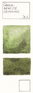
Emerald Green is usually known as phthalo green - a very useful mixing green, though I'd very very rarely use it alone. Russian Green is a lovely colour, though not especially light-fast so best in the protection of a sketchbook. The new Sap Green is made from chrome green and a transparent mid yellow so I'd expect it to be granulating and rather olive.
![]() |
| Yarka: St Petersburg watercolours - Emerald Green, Green Original, Green Light, Green (Russian), Sap Green (not shown). |
There are some interesting mixed greens in this range. Either Green Earth or Olive Green might be a good convenience foliage greens. Green Light is better knows as phthalo green yellow shade and oxide of chromium is a rather fascinating granulating pigment.
![]() |
| Yarka: St Petersburg watercolours - Oxide of Chromium, Yellowish Green, Green Earth, Olive Green, Yellow Ochre. |
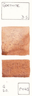
I like the earth colours Raw Sienna and Burnt Sienna best in this range as they are single pigment earth colours - always my preference if possible. The Red Ochre is interesting too, though not essential. I'd be interested to know if anyone else has managed to get a better colour from the Shakhnazarskaya Red? ![]() |
| Yarka: St Petersburg watercolours - Naples Yellow, Raw Sienna, Red Ochre, Shakhnazarskaya Red, Burnt Sienna. |
I like to see raw umber as a cool deep brown, but prefer it as a single pigment colour. Venetian Red is usually made with PR101.
![]() |
| Yarka: St Petersburg watercolours - English Red, Venetian Red (not shown), Burnt Umber, Mars Brown, Umber (Raw) |
And the darks. I prefer to pre-mix my own, but since these come in full pans in this range I'd tend to include Neutral Tint even though is has black pigment. The Sepia is a rich cool dark brown.
![]() |
| Yarka: St Petersburg watercolours - Sepia, Voronezhskaya Black, Payne's Gray, Neutral Tint. |
Antique Gold and Silver Deep are also available, but I haven't tried them. If you have, or any of the others not shown here, please add comments below.
![]() |
| Yarka: St Petersburg watercolours - Antique Gold (not shown), Silver Deep (not shown). |
While I don't prefer to use St Petersburg myself, preferring to use tubes of more highly pigmented watercolours, I think they are a remarkable range for the price, with some great colour and pigment choices for those who want nice large pans of colour for an excellent price.
Here is my suggested sketchbook set of 12. It is intended for plein air, travel or urban sketching in a sketchbook, where liftable blues are useful for the sky, and where lightfast ratings are less important. It includes Payne's Grey, which I don't usually recommend (since it is not possible to pre-make my usual Jane's Grey) as a convenience grey is really useful when sketching. It also has Sepia, which has black pigment, another I usually avoid - but this is a cool dark brown which is also useful for sketching. It has cadmiums, which I also usually avoid, but they are less opaque in this set and fill the spots nicely for a primary yellow and warm red.
![]() |
| White Nights Plein Air Set painted out clockwise from top left - Cadmium Yellow Medium, Golden, Cadmium Red Light, Carmine, Ultramarine, Cerulean, Emerald, Green (Russian), Raw Sienna, Burnt Sienna, Sepia, Neutral Tint. |
I suggested this set back in 2015 (before the new colours were added), and it has been put together as a
Plein Air Set, available from Larrypost.com.au for less than AU$50, which is excellent for a watercolour set. The palette is white plastic with good mixing spaces. They are all full pans so plenty of paint to splash around!
![]() |
Yarka White Nights St Petersburg watercolours - Plein Air Set.
(photo from Larrypost.com.au) |
There are also 24 and 36 colour sets, in much larger studio palettes, or the full pans can be purchased individually.
Happy painting :-)